Spotter
An iOS app to make it easier to find and track shows in the streaming era
Role
UX/visual designer
Platform
Mobile
Areas
Research, IA, UX, UI
Duration
4 Months
Role
UX/visual designer
Platform
Mobile
Areas
Research, IA, UX, UI
Duration
4 Months
Spotter is an iOS app concept designed to help users find and track movies and TV shows across multiple streaming platforms. Created as the final project for KSU's Interaction Design class.
My team and I set out to simplify digital streaming with an iOS app that helps users quickly find where to watch their favorite shows and movies. With platforms like Netflix, Hulu, Amazon, and Disney offering vast libraries, discovering specific content can be frustrating. Our goal was to solve this problem.
As the UX and visual designer, I was responsible for research, user interviews, testing, UX strategy, and visual design.
Our team consisted of a UX/visual designer (myself), a team lead/designer, and a prototyper/visual designer.
We followed the Goal-Directed Design process, a structured approach that prioritizes research and testing before moving into modeling and design. This method allowed us to deeply understand the domain, define clear objectives, and ensure our design decisions were informed by user needs and project goals.
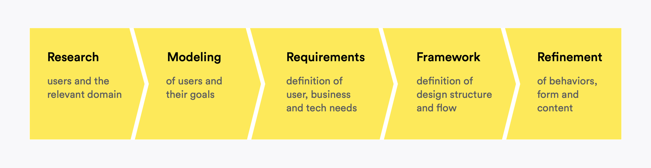
Goal-Directed Design Process

Help users discover new and existing content they may want to watch (Our users' biggest pain point)

Centralize the latest streaming content around diverse categorization and include robust details for each listing

Improve filtering, sorting, and the clarity of which content is entering and leaving platforms
We analyzed five streaming discovery platforms, assessing search accuracy, usability, and features like personalization.

We interviewed three students that had varying levels of streaming service usage. The goal was to get a range to cover multiple use-cases. I took notes and asked follow up questions whiles my teammate moderated.
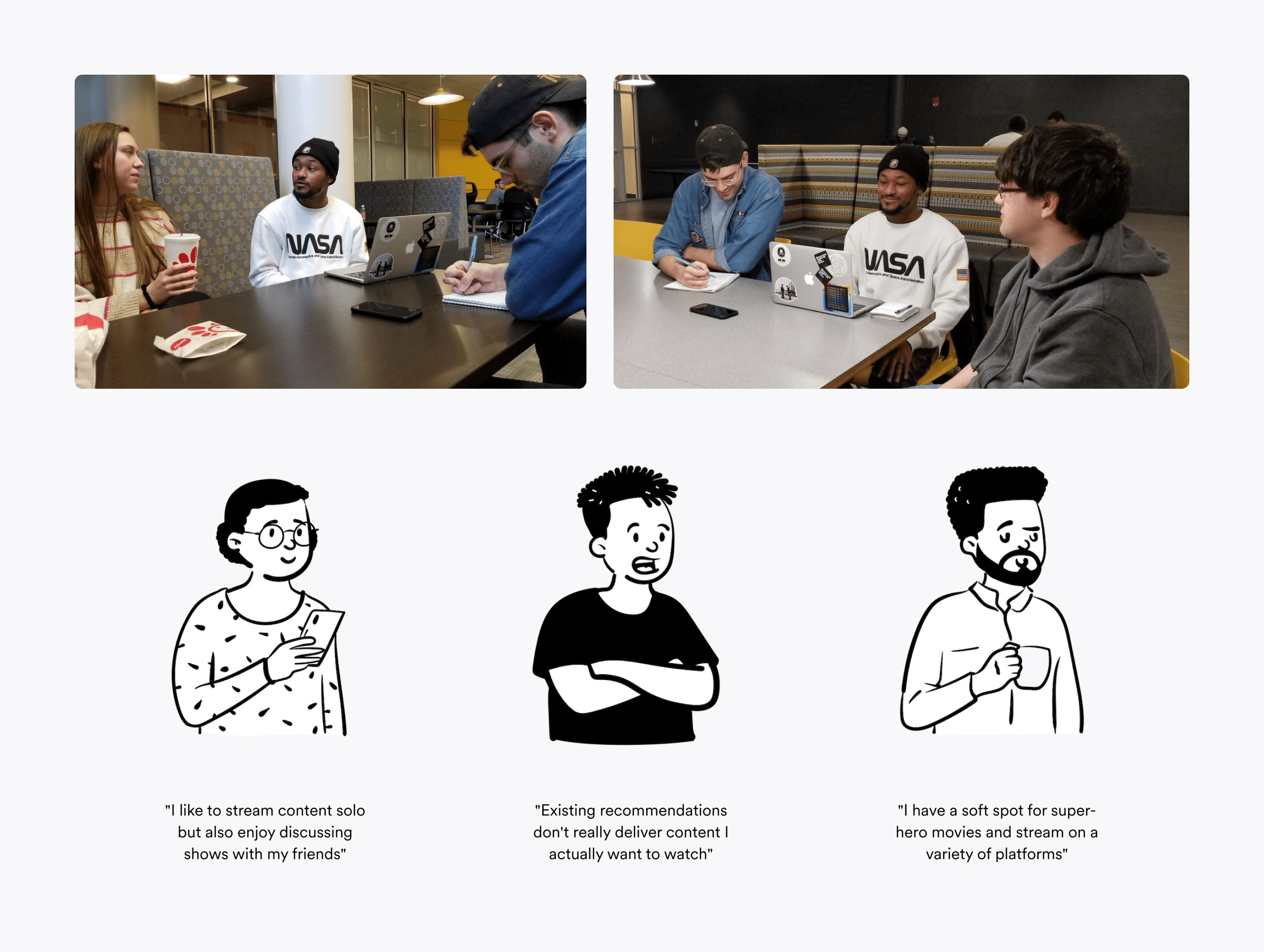
In-person interviews and standout quotes
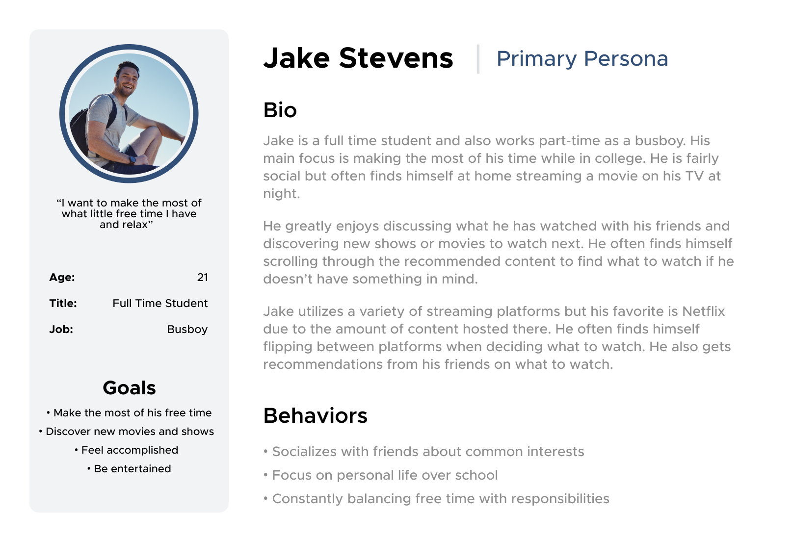
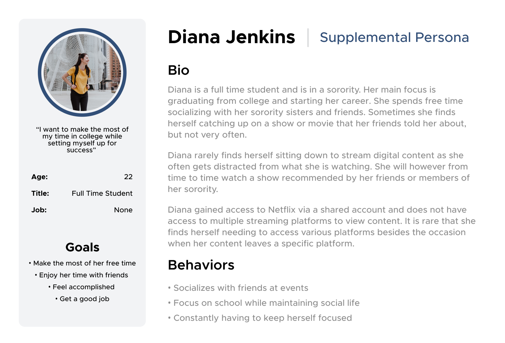
Our primary and supplemental personas
We placed personas in context scenarios to understand how they may use an app like Spotter, and what requirements they may have for its functionality. We identified these four needs:
Find a specific movie or show and where it can be streamed
Display information in an easily digestible format
Recommendations of content personalized to the user

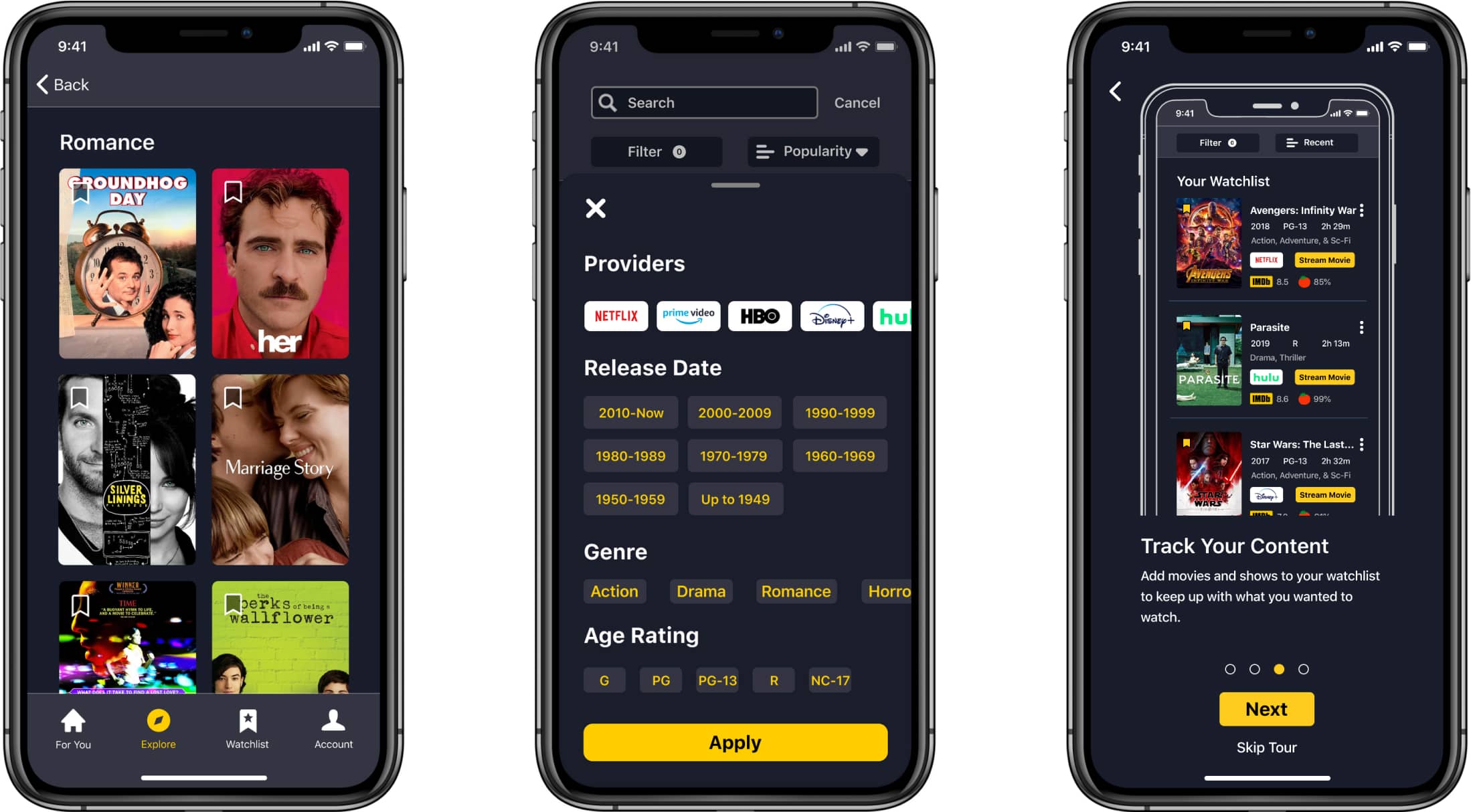
Ability to keep a running list of shows the user is wanting to watch
To guide our wireframes, we first tried to determine a key path scenario that would imitate the most utilized path one might take within the app. From there, we began remote usability testing and refinement of our wireframes.
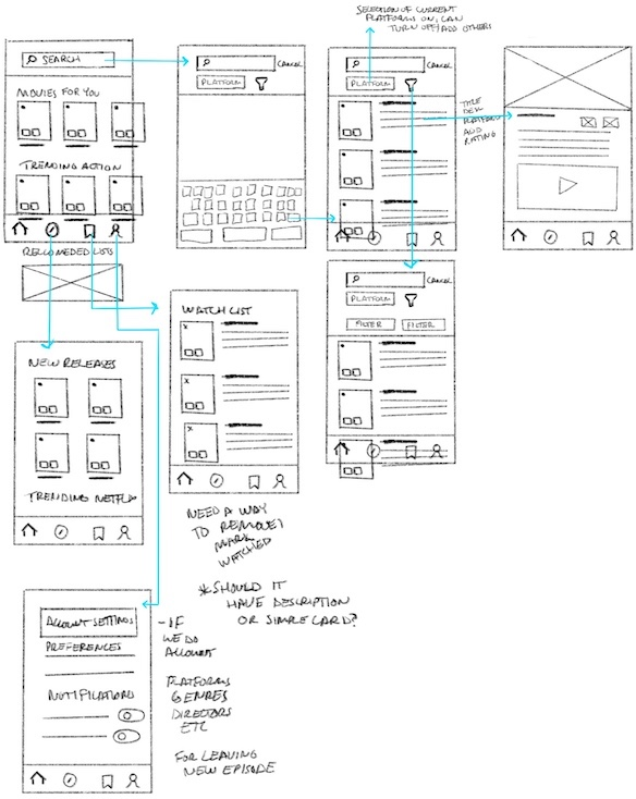
The final designs prioritize clarity and visibility. Providing more labeling, better grouping and better use of white space for easy scanning.
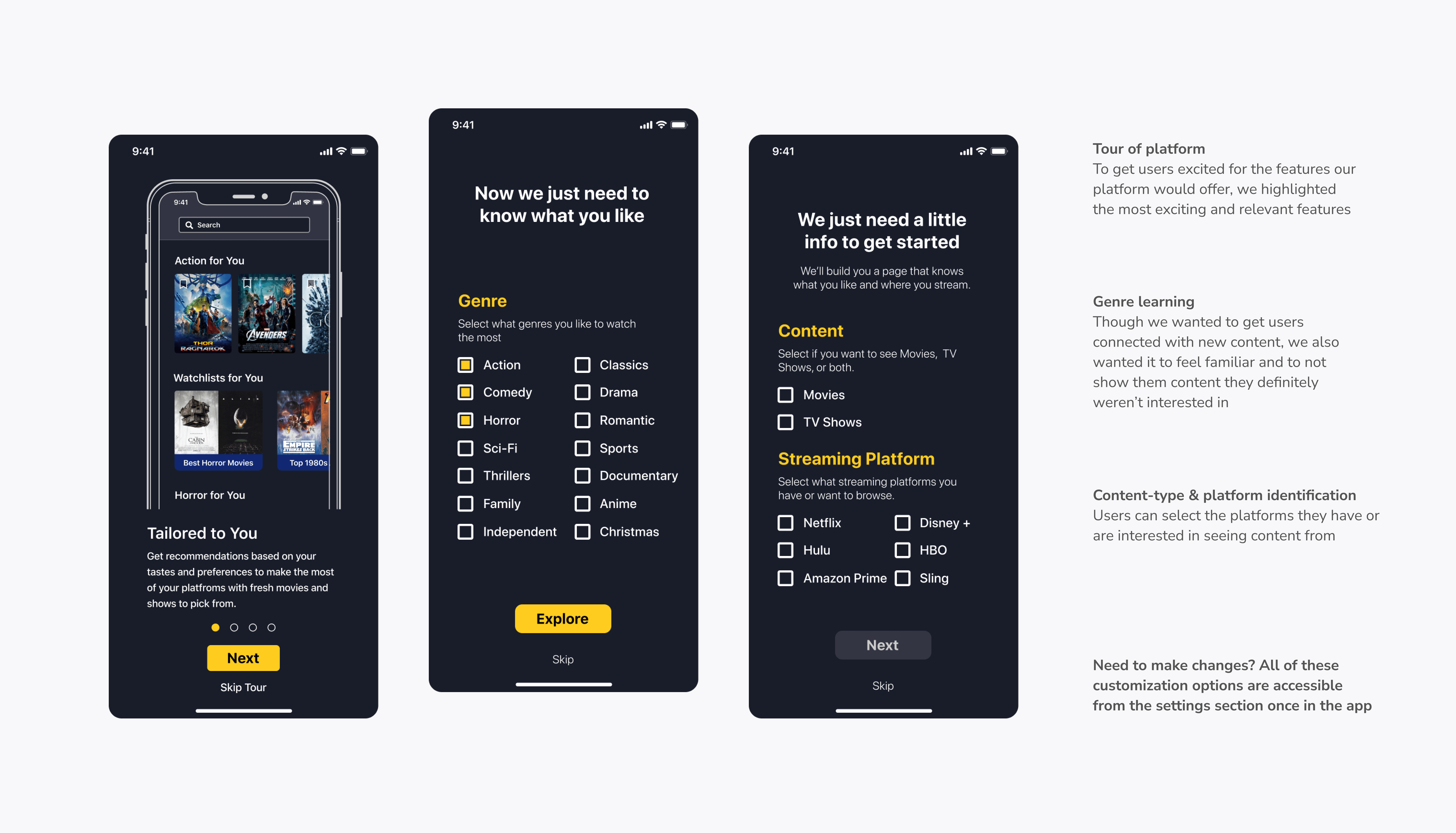
Goal 1: Discover relevant content
We addressed our first goal by designing a robust onboarding experience that gets to know your tastes and your streaming platform usage.
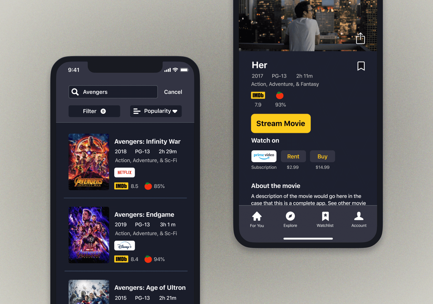
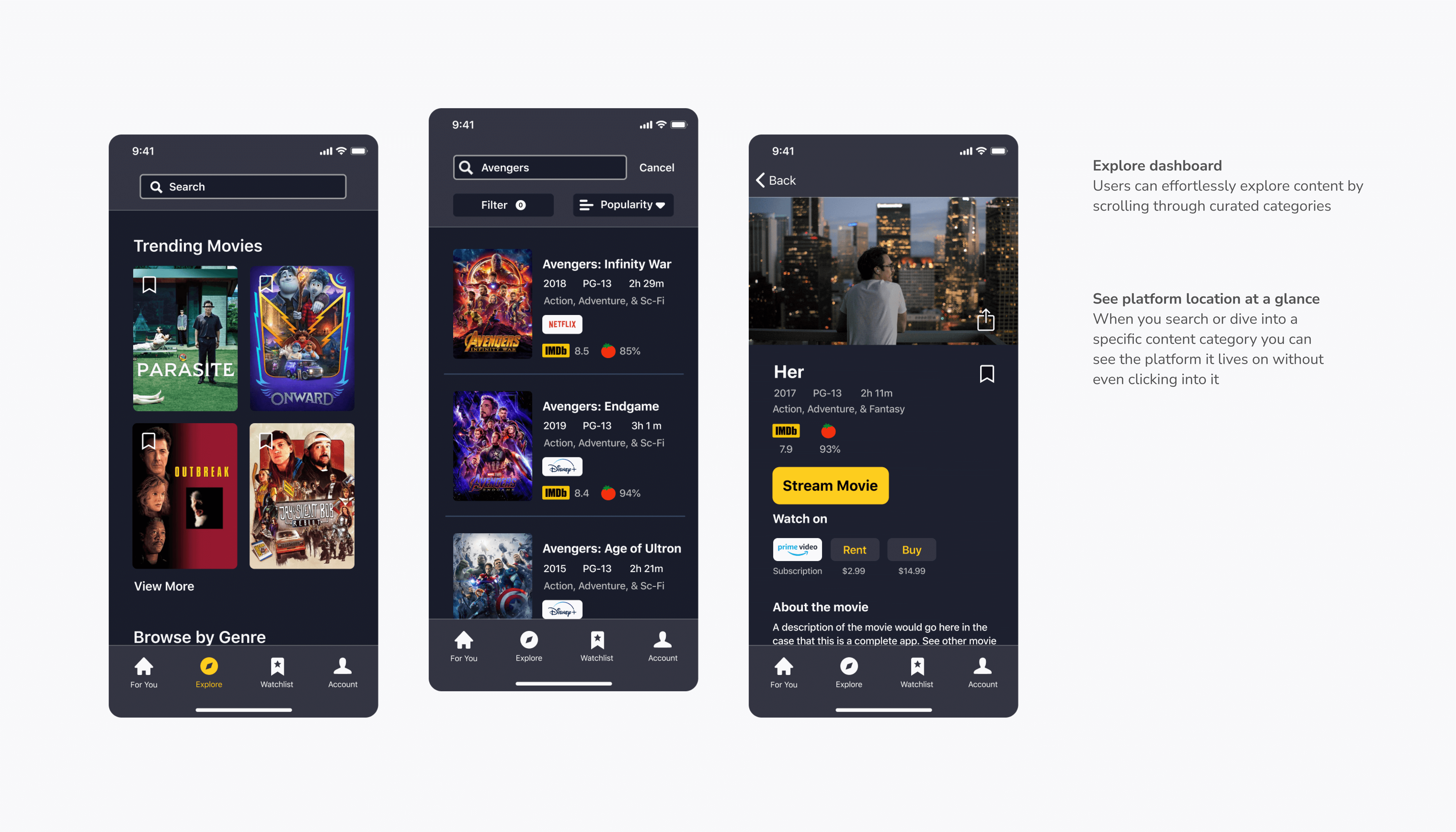
Goal 2: Simple content exploration with detailed listings
Our users wanted to be able to see which platform their content was on without too much trouble. We made it simple to explore without feeling overwhelmed by all of the options.
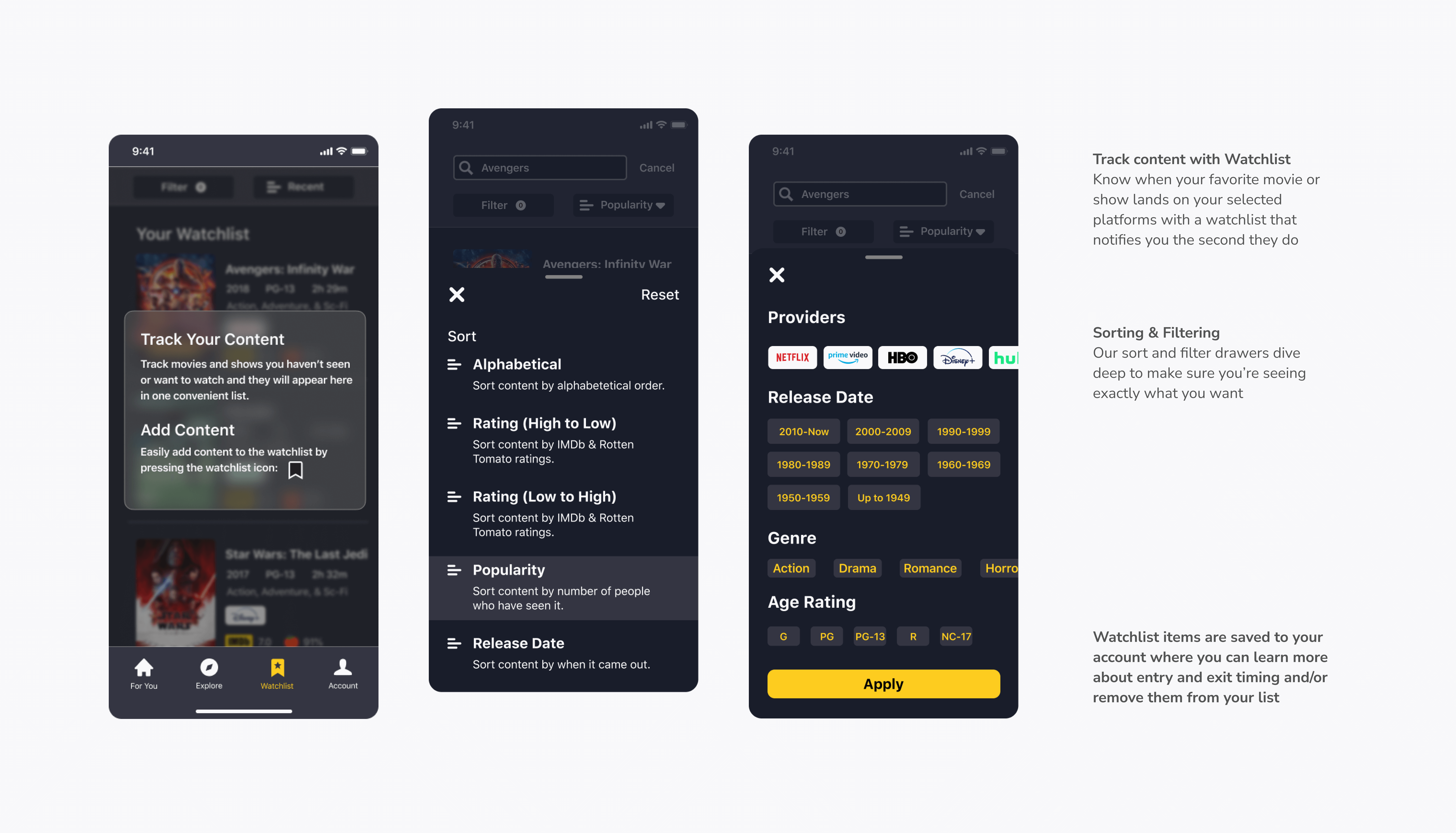
Goal 3: Enhance content filtering and sorting
Our audiences were desperate for a way to see which content was entering and leaving platforms and a way to filter by every category known to man.
Our user interviews and usability testing greatly impacted the final prototype we ended up with, and I learned a lot about the importance of iterative design through the many versions of the app we cycled through while trying to meet our users' needs.
The designs I came up with didn't always click with my teammates and the designs we finally agreed on didn't always meet our users' expectations. It was a lesson in compromise and I was lucky to have a team that could pivot and approach each problem that came up in a way that always resulted in either a new perspective or an improved app feature.