Employer
Marketwake
Platform
Desktop, mobile
Areas
UI, research, IA, UX
Duration
3 months
Product designer
I led design on this project —handling research, prototyping, usability testing, and final deliverables, as well as some client communication.
1 designer (me), 1 project manager, and 1 engineer.
FlowPath is an operational software used by maintenance professionals to assign, track, and organize tasks for their team. Maintenance teams rely on FlowPath daily for quick response and accuracy in their work.

Research & analysis
Identify user needs, key workflows, and pain points through research and competitor audits.

Architecture
Map the platform's structure, define key redesign areas, and refine user flows.

Design & iteration
Develop new UI based on insights, enhancing clarity and accessibility where possible.

Handoff
Deliver finalized screens and a comprehensive UI toolkit, ensuring consistency and scalability.
Given a tight timeline, we had about 2 weeks for initial research and analysis.
I started by reviewing the user data provided and conducting two client meetings to understand the audience use cases. This helped me identify two primary user types, which informed the next steps in mapping the platform's architecture.
"The task master"
The task master is usually the head of a maintenance dept. and creates tasks. Needs an easier way to create/organize tasks for their team, to search content globally, and to have better awareness of updates to tasks as they occur.
"
"

I need a faster way to assign tasks, find things, and stay on top of updates.
"Operators"
Operators quickly reference their kanban to see tasks, record completion, and track time spent on tasks throughout the day. Some workers will have edit access and may need to update key portions of tasks.
"
"

Keep it simple. I track tasks, log progress, and update when needed.
I analyzed the current app through the lens of these user perspectives to identify key opportunities for improvement that aligned with their goals and priorities.
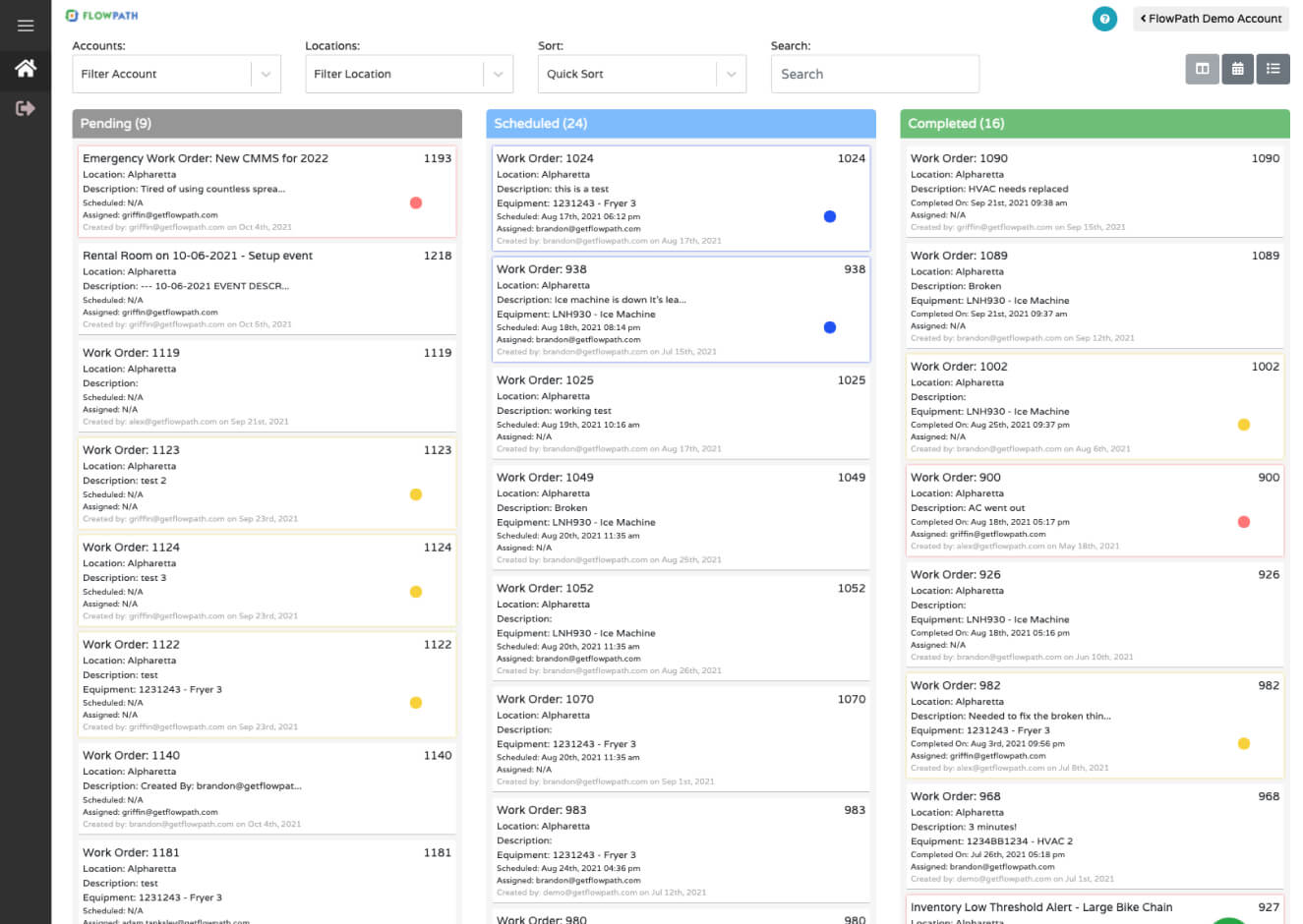
Original kanban board
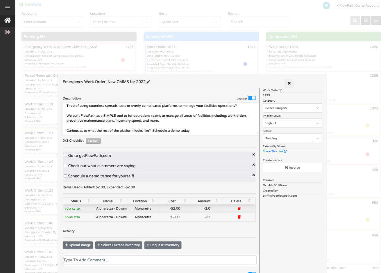
Original work order modal
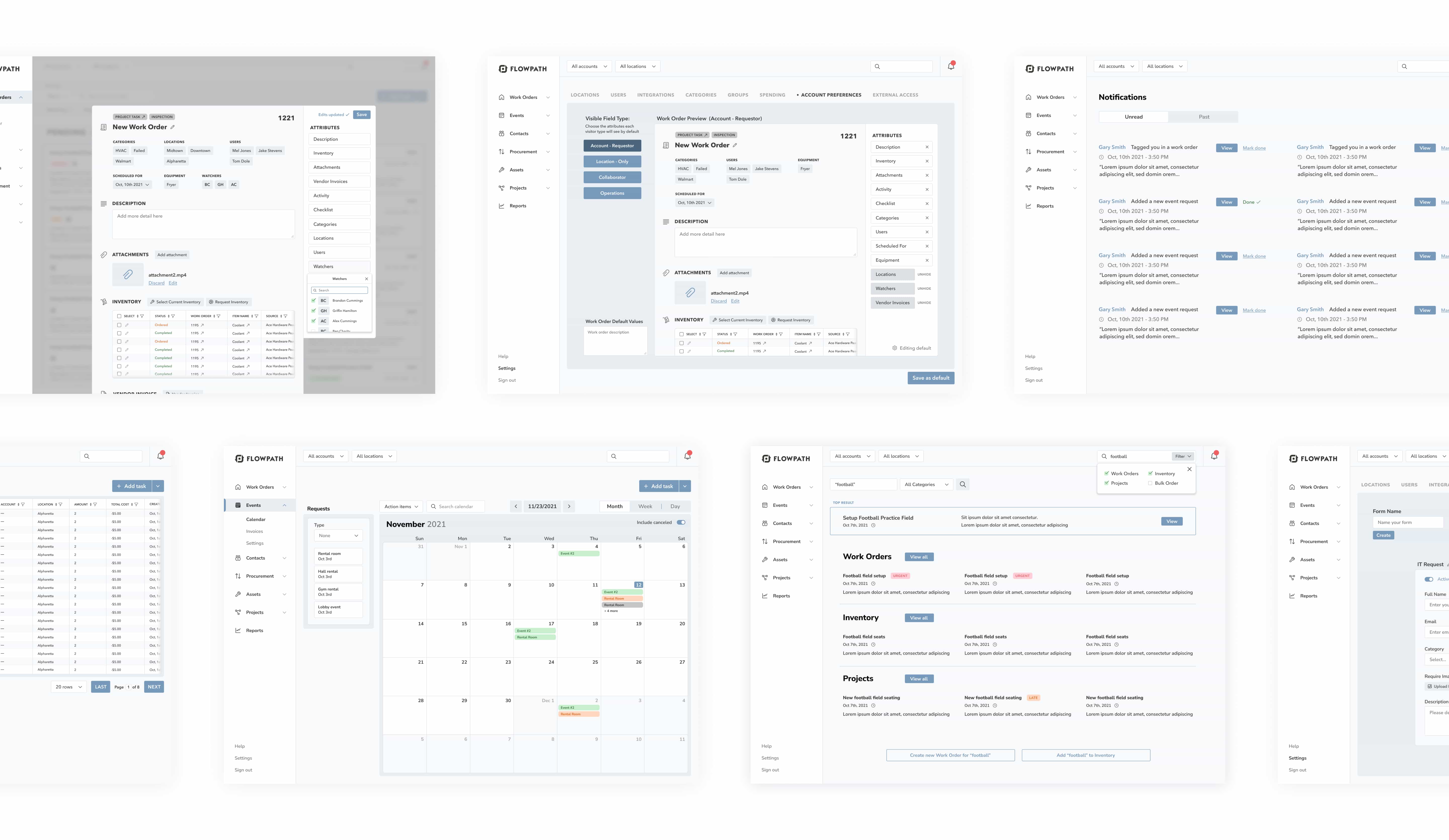
With a clearer understanding of our users and an analysis of the current app, I collaborated with stakeholders to develop a flow map outlining the platform's most-used screens, key interactions, and priority action items.
High-use screens were highlighted in blue, key interactions marked with red lines, and critical actions outlined in boxes. This visualization served as a roadmap for identifying areas in need of redesign and optimization.

Flow map of highest-use screens (blue boxes), key interactions (red lines), and top action items (outlined boxes)
I analyzed the pain points identified by users, mapped them onto the user flow, and pinpointed 12 key screens in need of redesign to better align with user goals. I then created a high-fidelity prototype in Figma to facilitate discussions with stakeholders and gather usability insights throughout the process.
Although user testing was outside the scope and timeline at this stage, I conducted testing with the CEO and Head of Development to gather valuable feedback.
A key insight revealed that the work order modal needed additional attribute sections to better support user needs when creating work orders. In response, I introduced dynamic attributes, which optimized space for the development team and enhanced user efficiency.
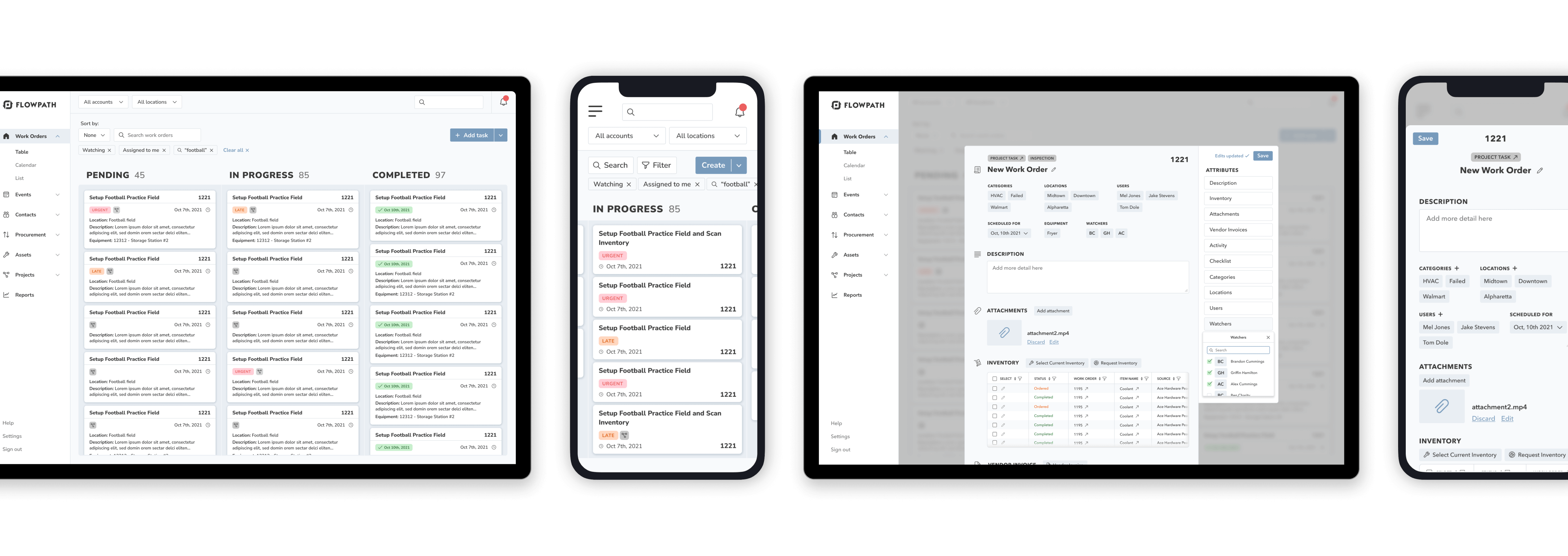
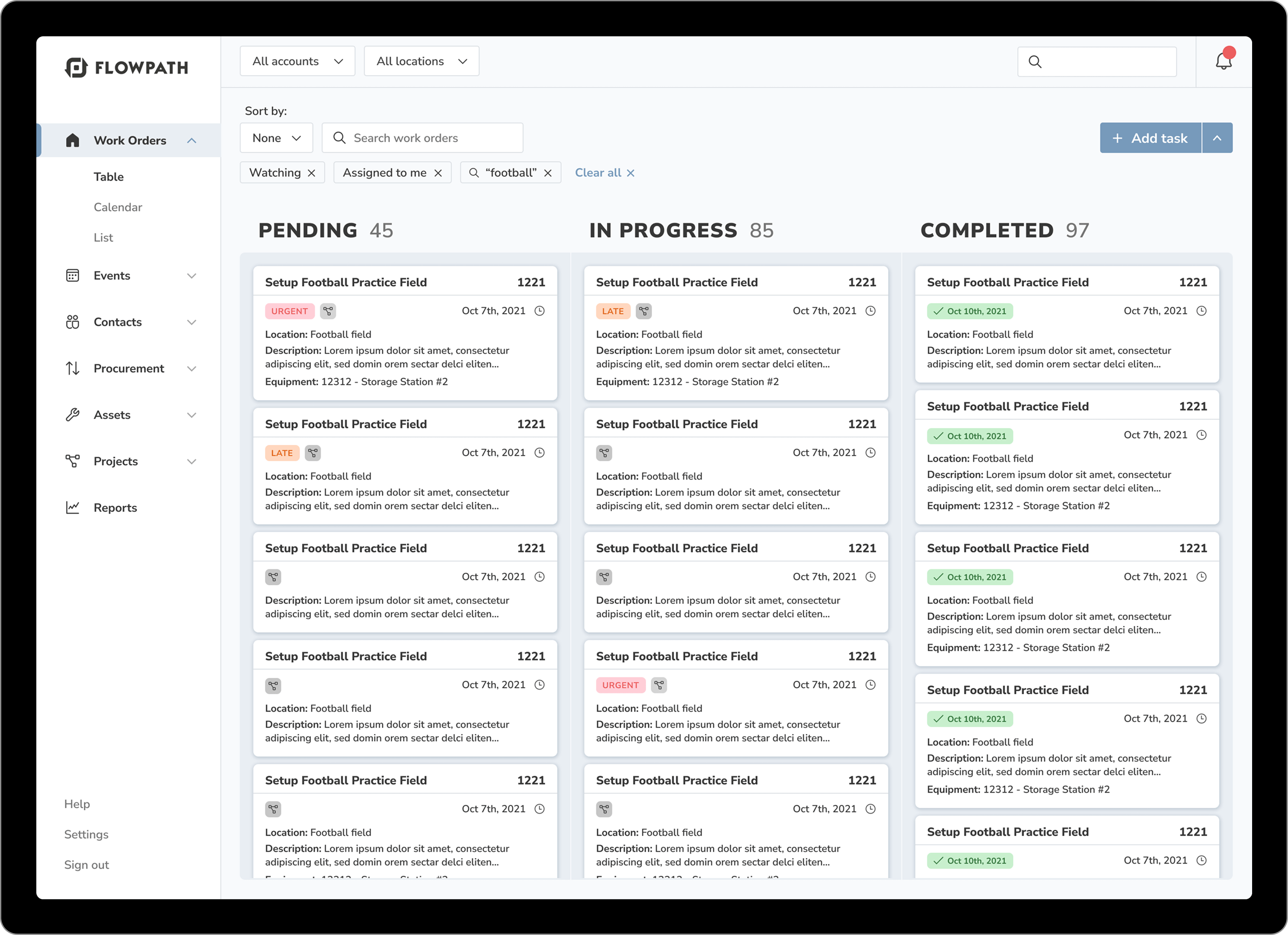
The final designs prioritize clarity and visibility, making it easier to find information at a glance. With clearer labels, better grouping, and improved use of white space, users can scan and navigate tasks more efficiently, reducing friction in their workflow.
Kanban Board and Work Order Modal
New design uses similar placement so returning users still know where everything is. Additions have clear labels and add functionality to the platform.
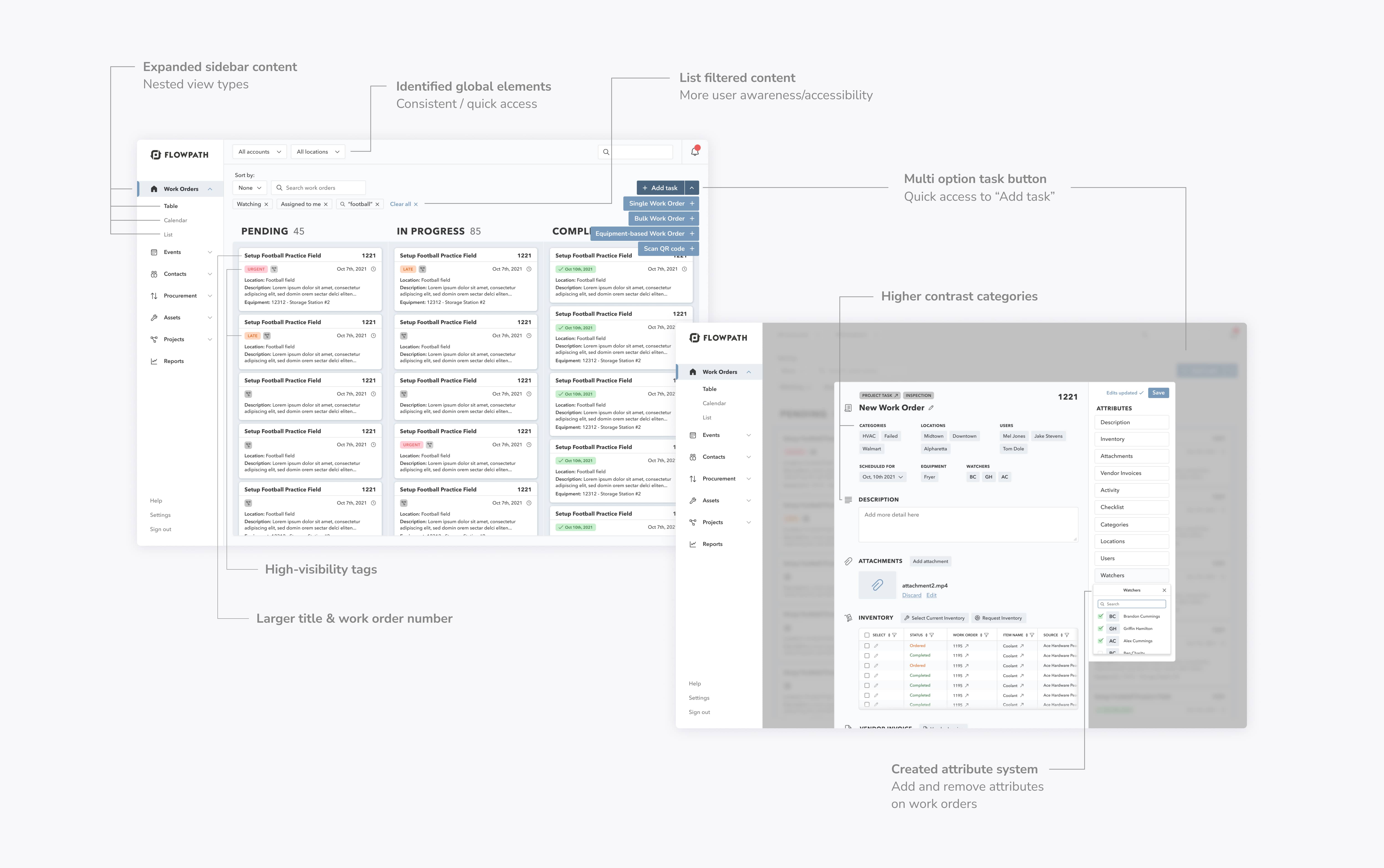
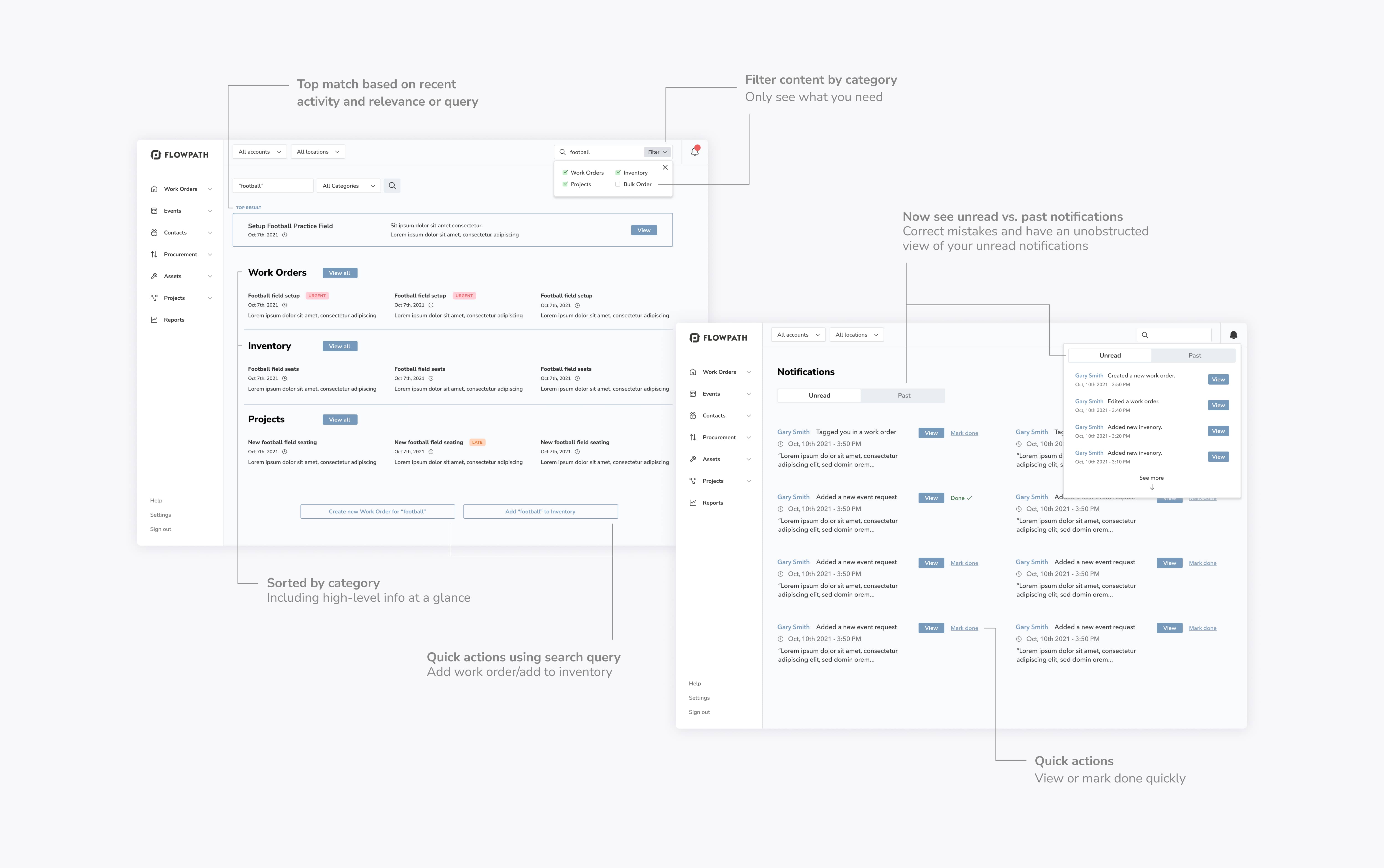
Search Results & Notifications
Having global search allows quick access to content across a user's entire account. Awareness of updates and edits to work orders is essential to all FlowPath users –added notifications to gain that awareness.
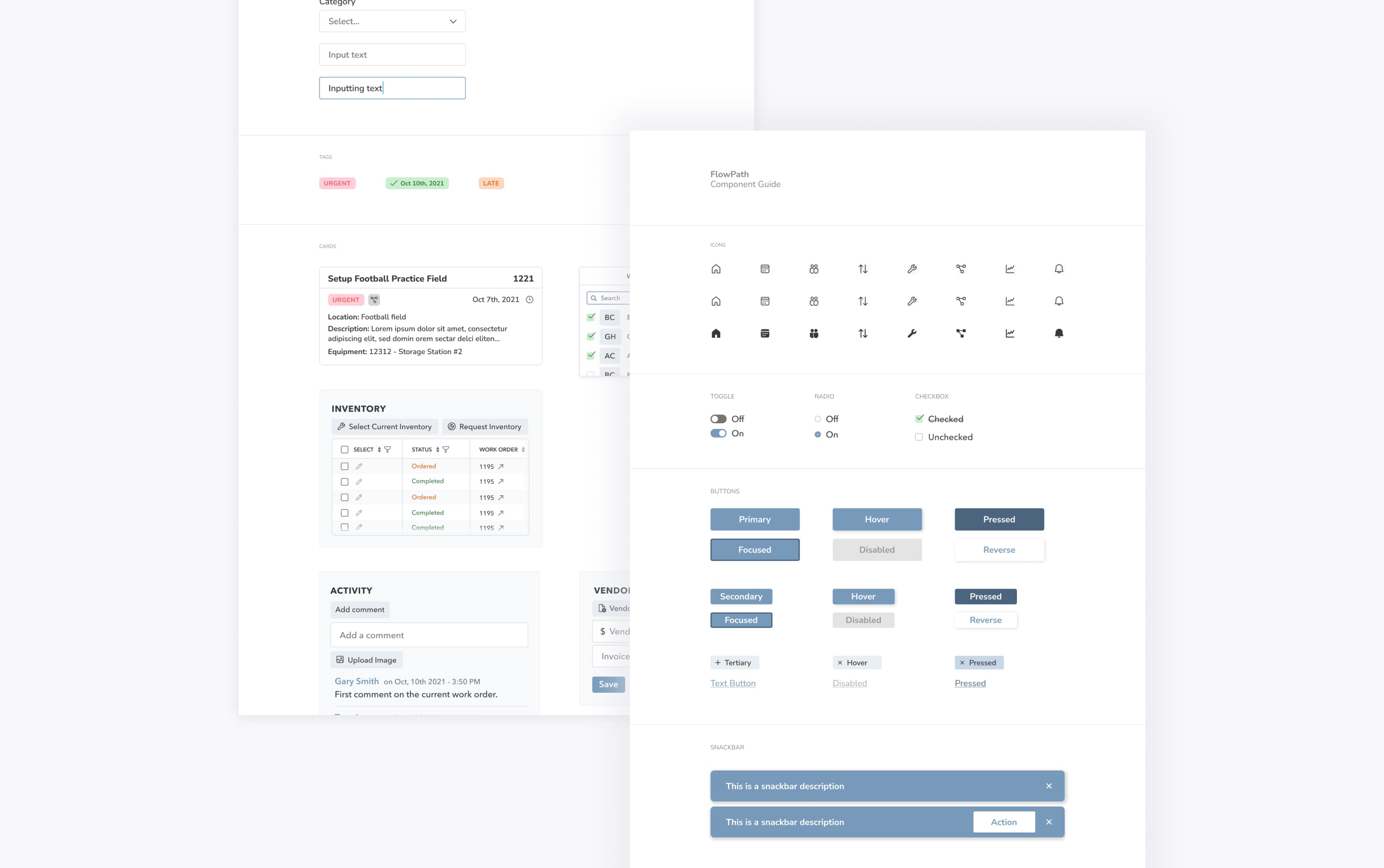
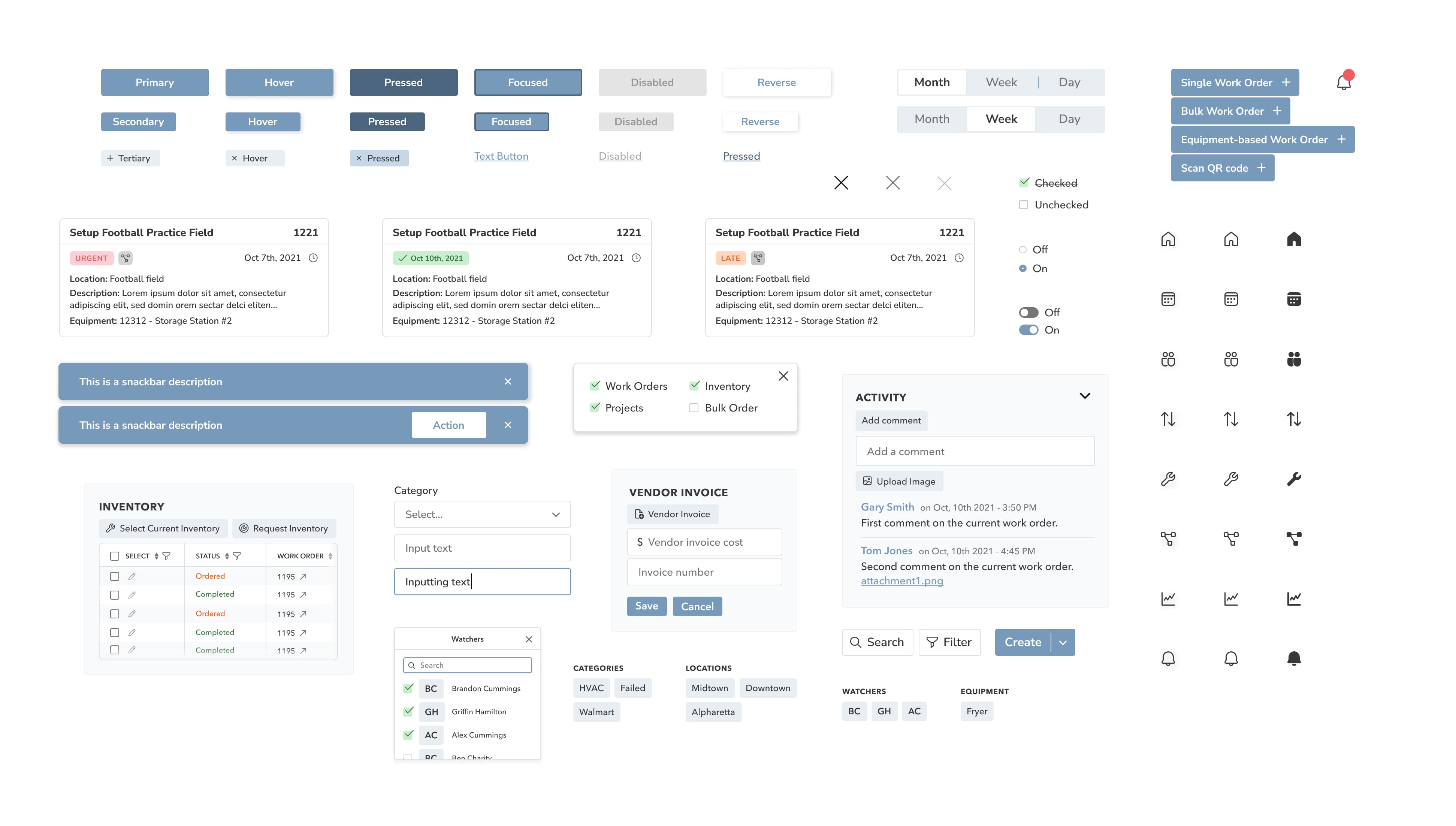
Along with the finalized screens, I provided a structured sticker sheet in Figma to ensure design consistency. Components were organized using atomic design principles, enabling scalability and maintainability.
One of our biggest challenges was identifying and prioritizing the most critical screens for redesign, as requested by our client. Initially, we approached this internally, but without early collaboration, we later had to backtrack to realign on priorities. Involving the client sooner would have streamlined our workflow, minimized last-minute adjustments, and allowed more time for valuable feedback and refinement.
Despite these challenges, the final designs improved task completion efficiency by an estimated 25%, based on client-reported usability testing and internal feedback.