Employer
Marketwake
Platform
Desktop
Areas
UI, research, IA, UX
Duration
4 months
Product designer —Led this initiative by building a business case and presenting it to leadership.
Conducted a comprehensive UX/UI audit, user research, usability tests, and prioritized goals and tasks.
Led all design efforts including IA, wireframes, prototypes, hi-fi designs, new components, and created design documentation.
1 designer (me), 1 product manager, and 2 engineers.
Punchlist is a collaborative feedback and approval tool designed for creative projects. It allows teams to leave comments, provide critique, and manage approvals directly on visual assets like websites, ads, and videos...instead of drowning in a 50-thread email exchange critique.
Marketwake recently acquired Punchlist and we were becoming aware of multiple areas of opportunity. This project was our first effort to tackle some of these needs.
We would be relaunching our marketing website alongside our first paid search campaigns and I was in charge of having the app demo-ready for new clients. This case study outlines how I approached this challenge and refined UX/UI while supporting business goals.
This was leading to poor user feedback, difficulty demoing to prospective client, and internal team confusion/overlapping design efforts.
Working on many of these design efforts, I had a front row seat to many of the things causing gaps in our product and processes.
Through a series of meetings with teammates and leadership, reviewing past user interviews, as well as hands-on exploration of the app—laying out our sitemap and testing workflows—I prioritized areas where design improvements could have the greatest impact and laid out the perceived business impact.
Three focus areas critical to improving user satisfaction and adoption were identified:
These 6 users, a mix of small to medium-sized creative team members and leaders, represented our target audience and were active users of the platform —some new some veterans. By exploring their workflows, challenges, and goals, I uncovered three recurring themes that shaped the focus of my approach.
All of these users were struggling with:
"
"

Our dashboard is a free for all. No structure or organization but maybe we're just lazy?
"
"

Wait, are 'items' the same as 'comments'? Is 'feedback' something different?
"
"

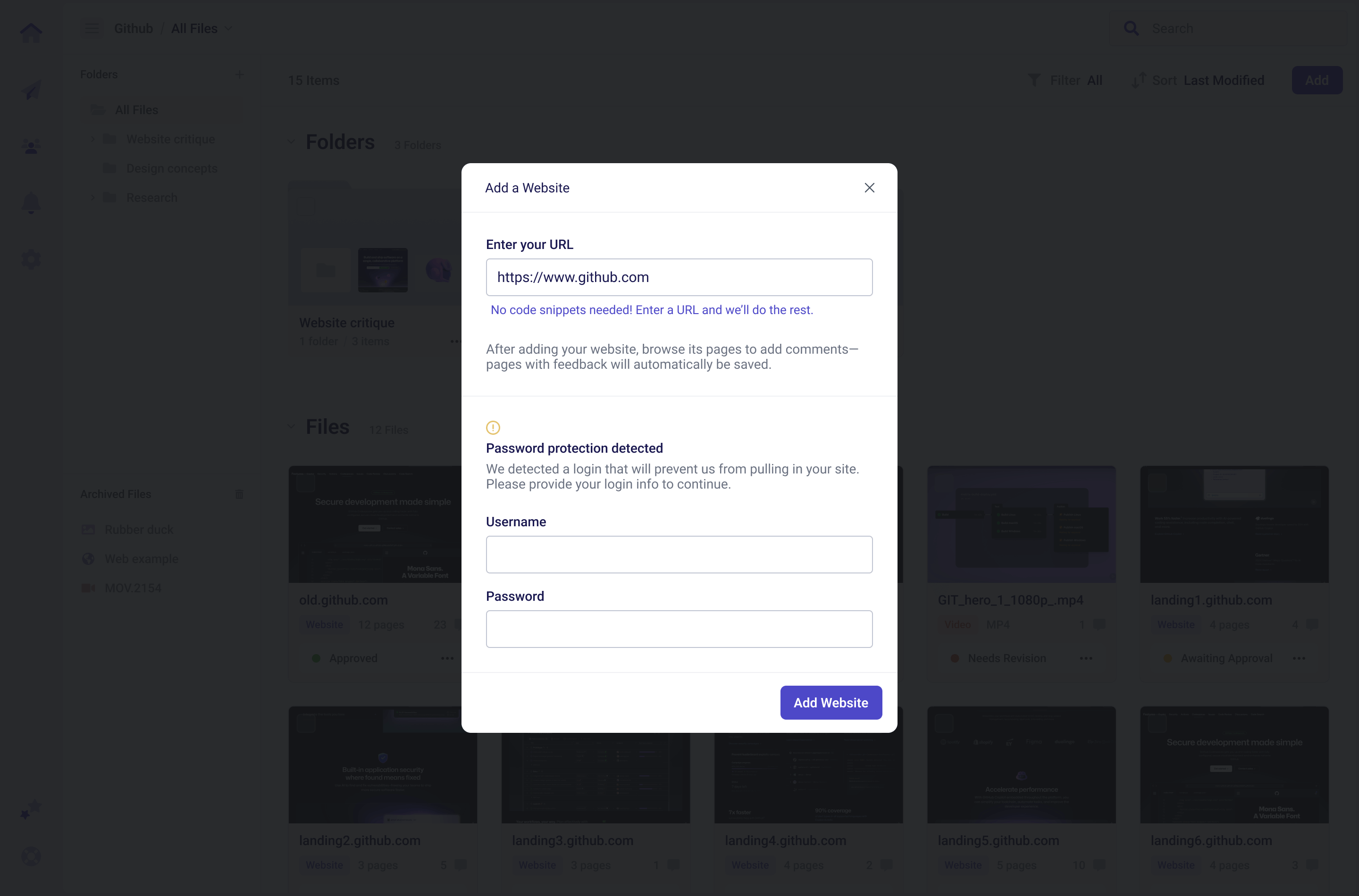
We use Punchlist for live sites. Uploading designs from Figma is too tedious for us.
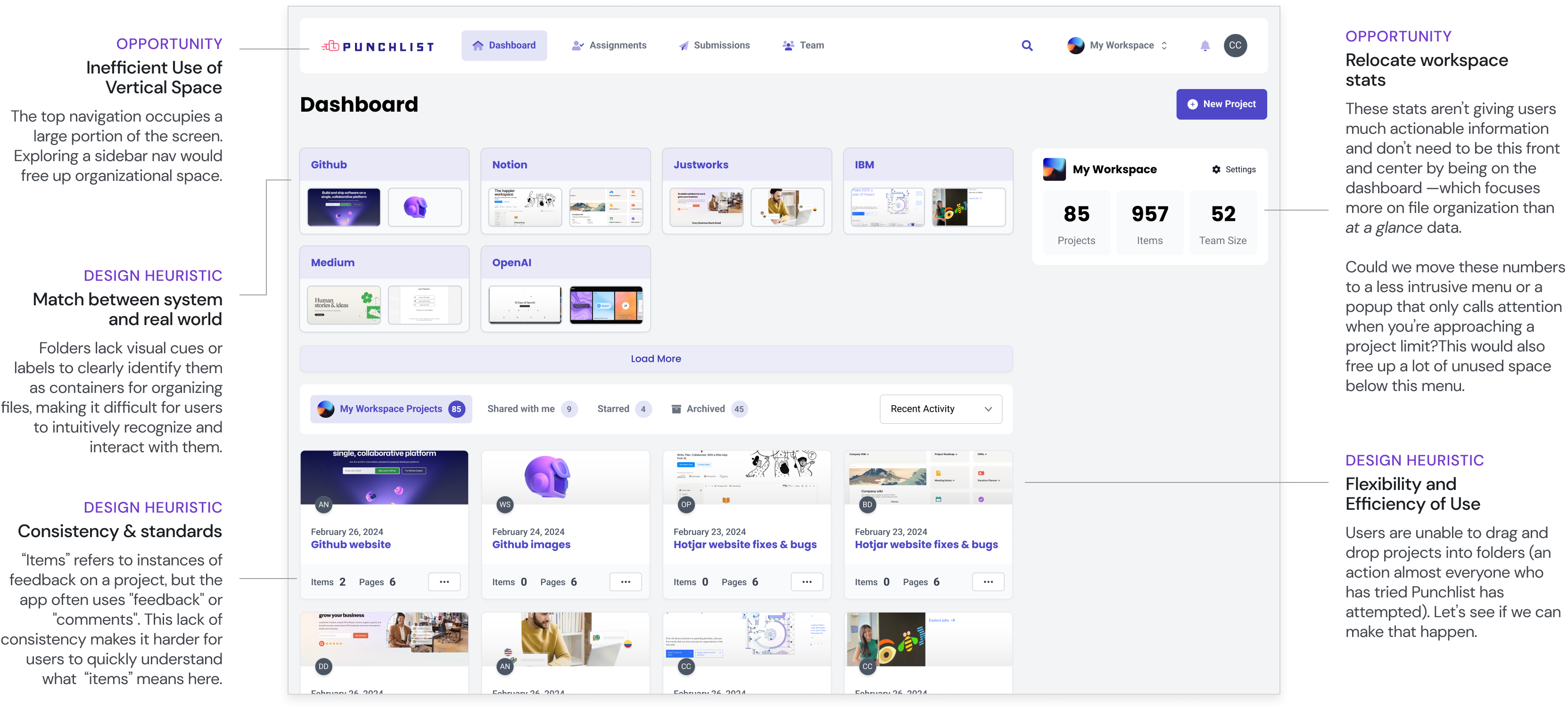
While folder functionality technically existed, users didn't recognize it or feel confident using it.
Navigating between folders and files was complex, and in some scenarios, impossible.
Over time, blind updates and patching caused screens to become a kitchen sink of bloated functions and overlapping terminologies.
With no design system or documentation, UI felt inconsistent and outdated. This also made tracking updates and maintaining integrations difficult.

Looking at relevant UI helped me identify specific areas of opportunity for upcoming design iterations.
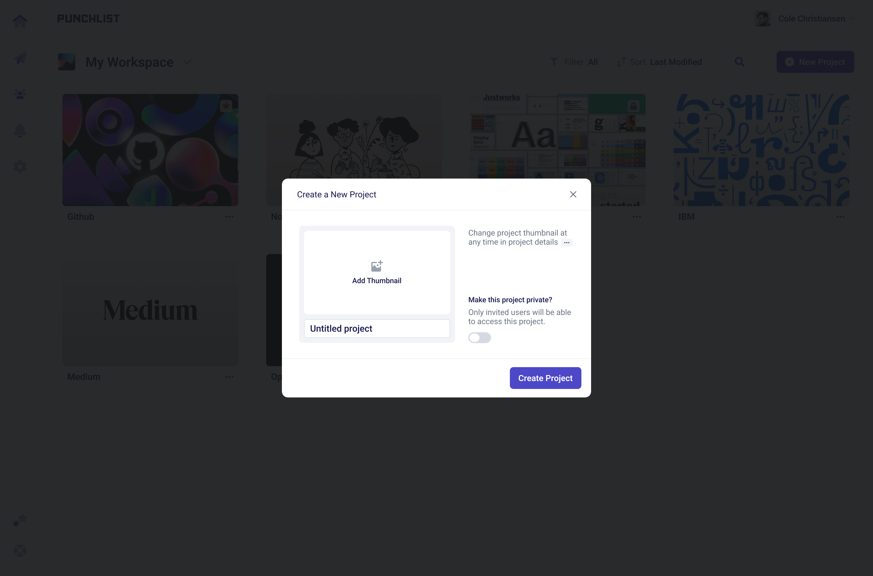
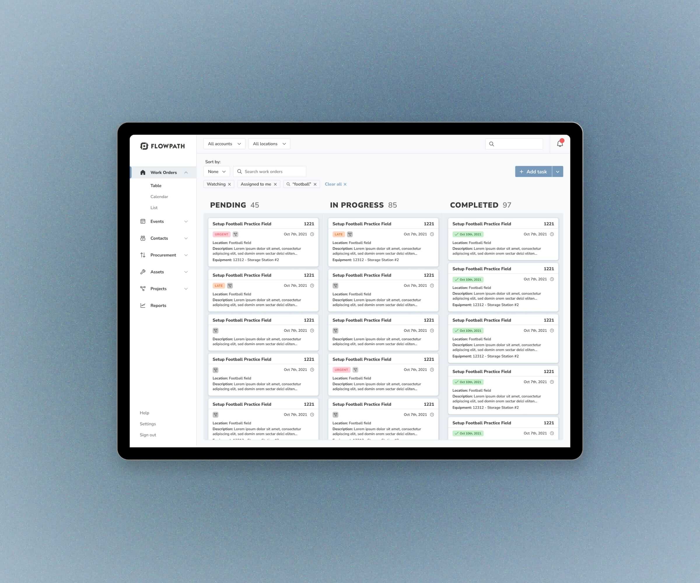
Old dashboard & project creation modal
Old folder page
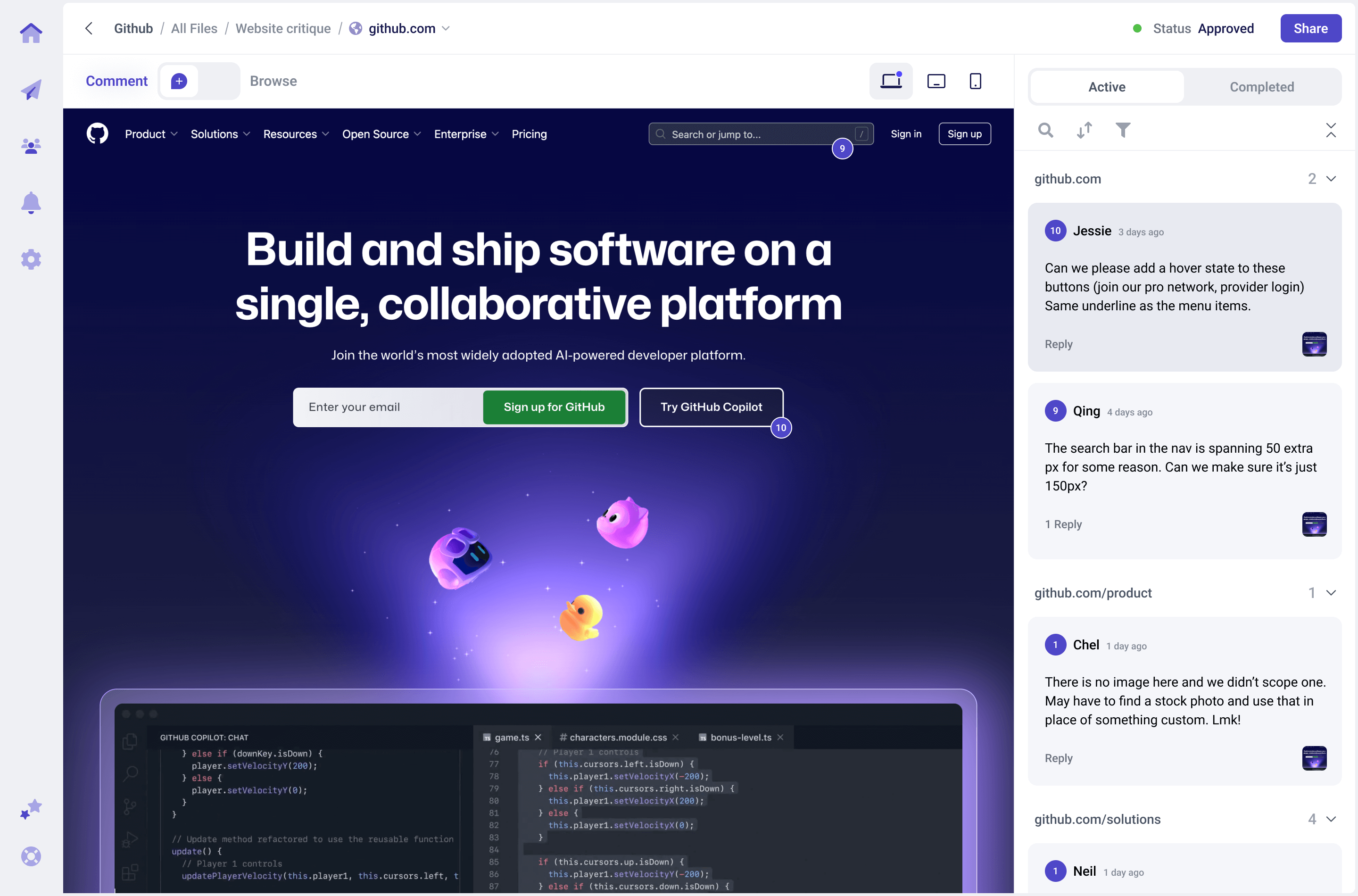
Old website-project page (annotation page)
I looked mostly at direct competitors like Markup, Pastel, and Marker. This research helped highlight industry standards and potential opportunities for us to serve Punchlist users better.
Key takeaways:
Next, I reworked the workflow, starting with open-ended visual ideation through "no bad ideas" sketches, followed by low-fidelity wireframes and finally, fully designed screens.
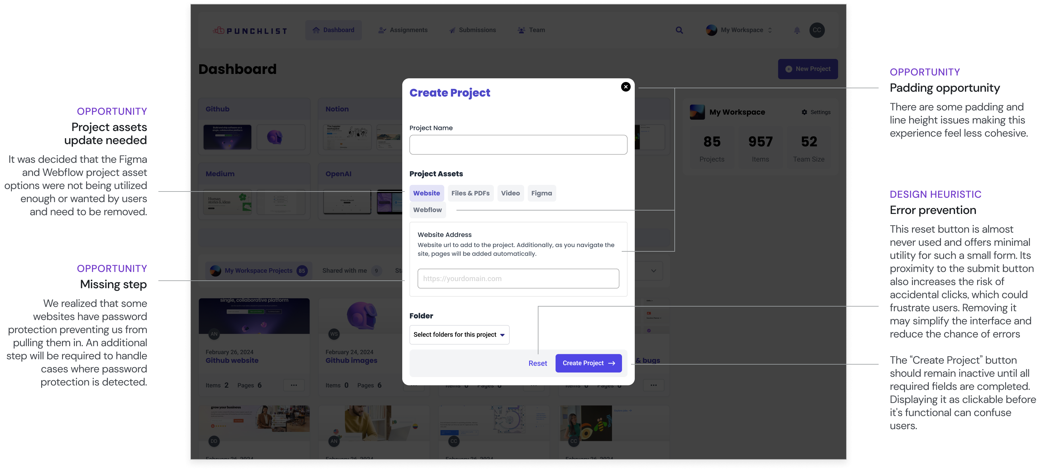
Due to a shortened project timeline that emerged at this stage, we only had time for a single round of usability testing, which I conducted once we had a clickable prototype. Throughout the design process, I focused on dev feasibility, working closely with the team to ensure each change was technically achievable.
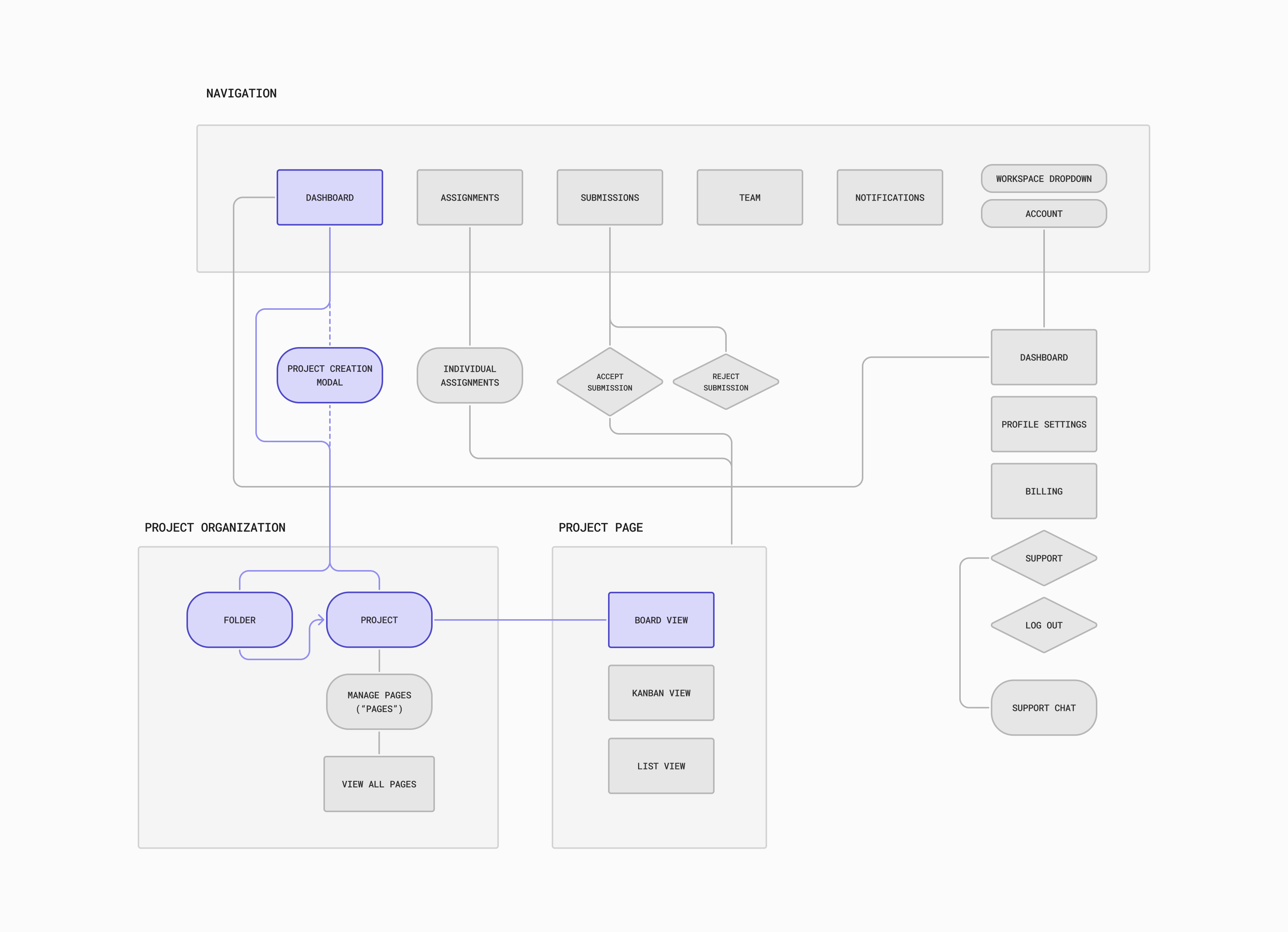
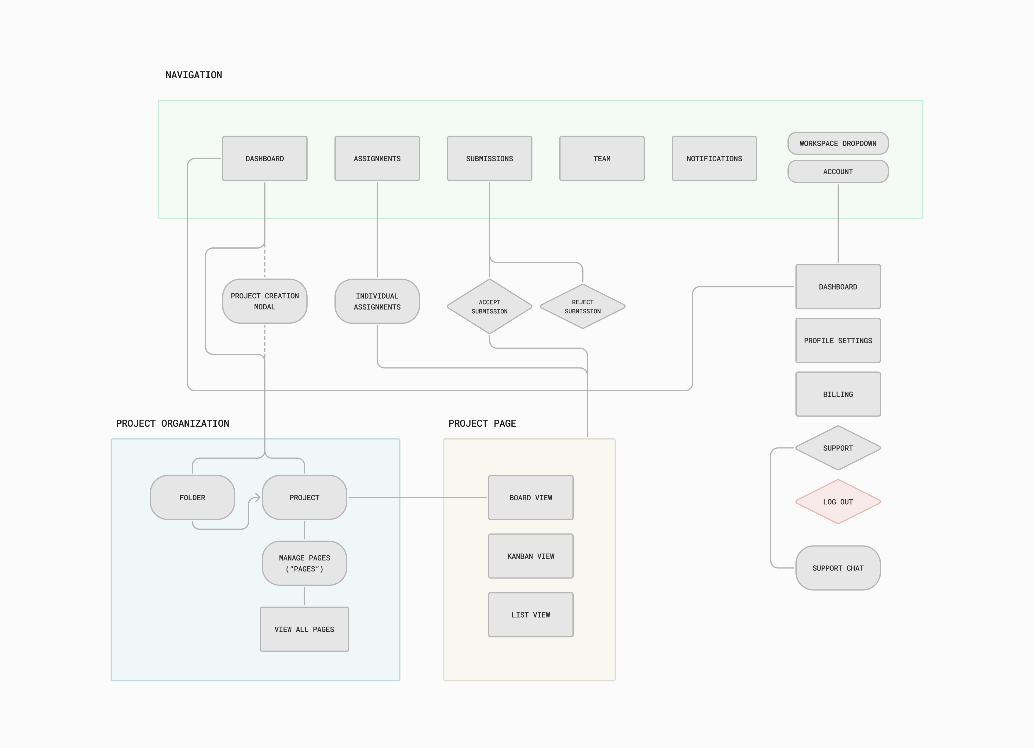
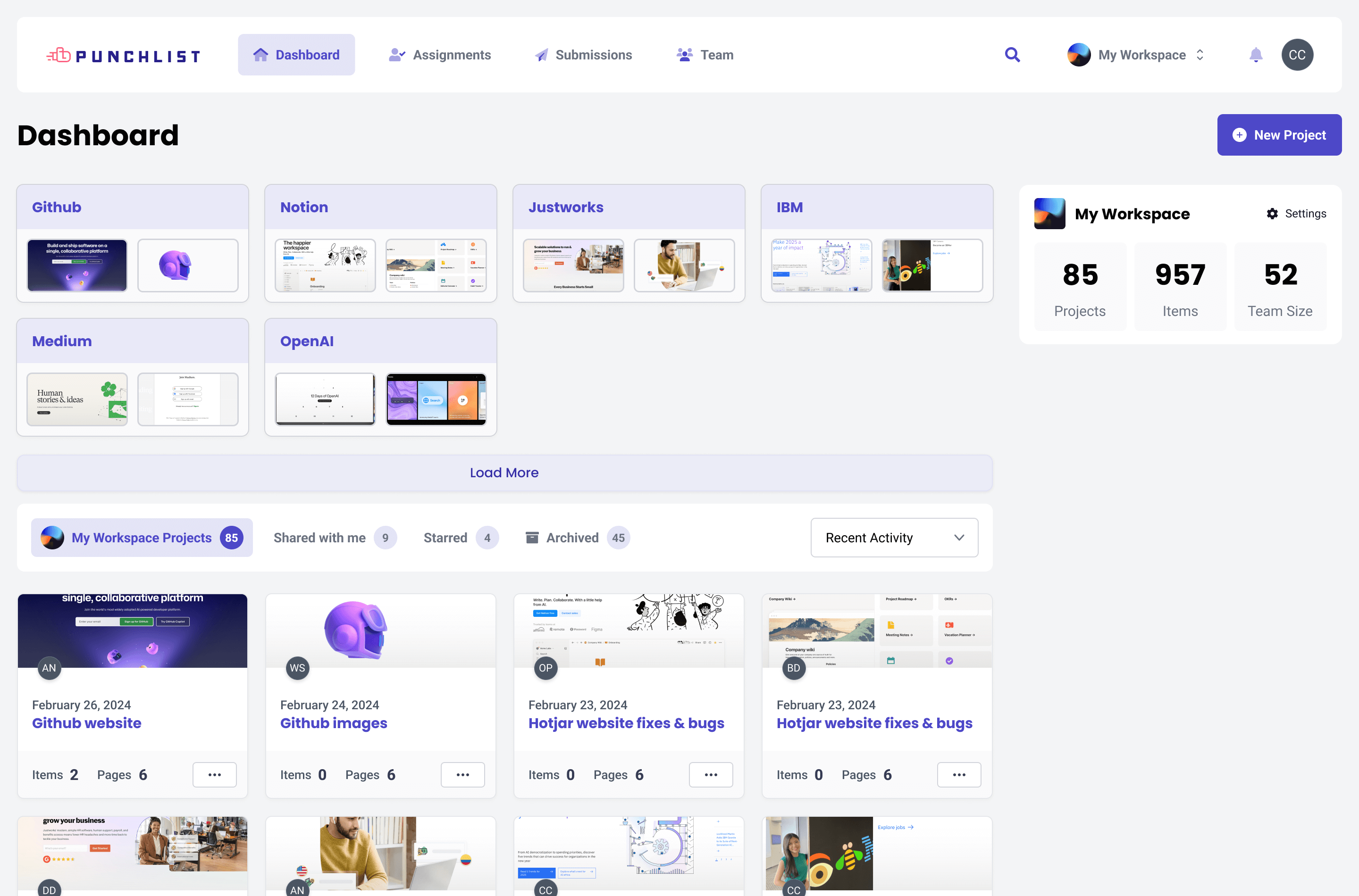
From user interviews, to ux/ui and competitive analysis, it was clear the current flow and naming around our dashboard were not serving users as well as they could.
The first change was simple...add a project page to make creating individual clients or projects feel more natural. An extra layer of organizational goodness.

What was previously called "Project" was renamed to "File" to better describe its role as individual assets
The term "Projects" was redefined to represent this new parent layer
Next, I laid out rough sketches to get our two main flows down: project creation and file organization & creation.
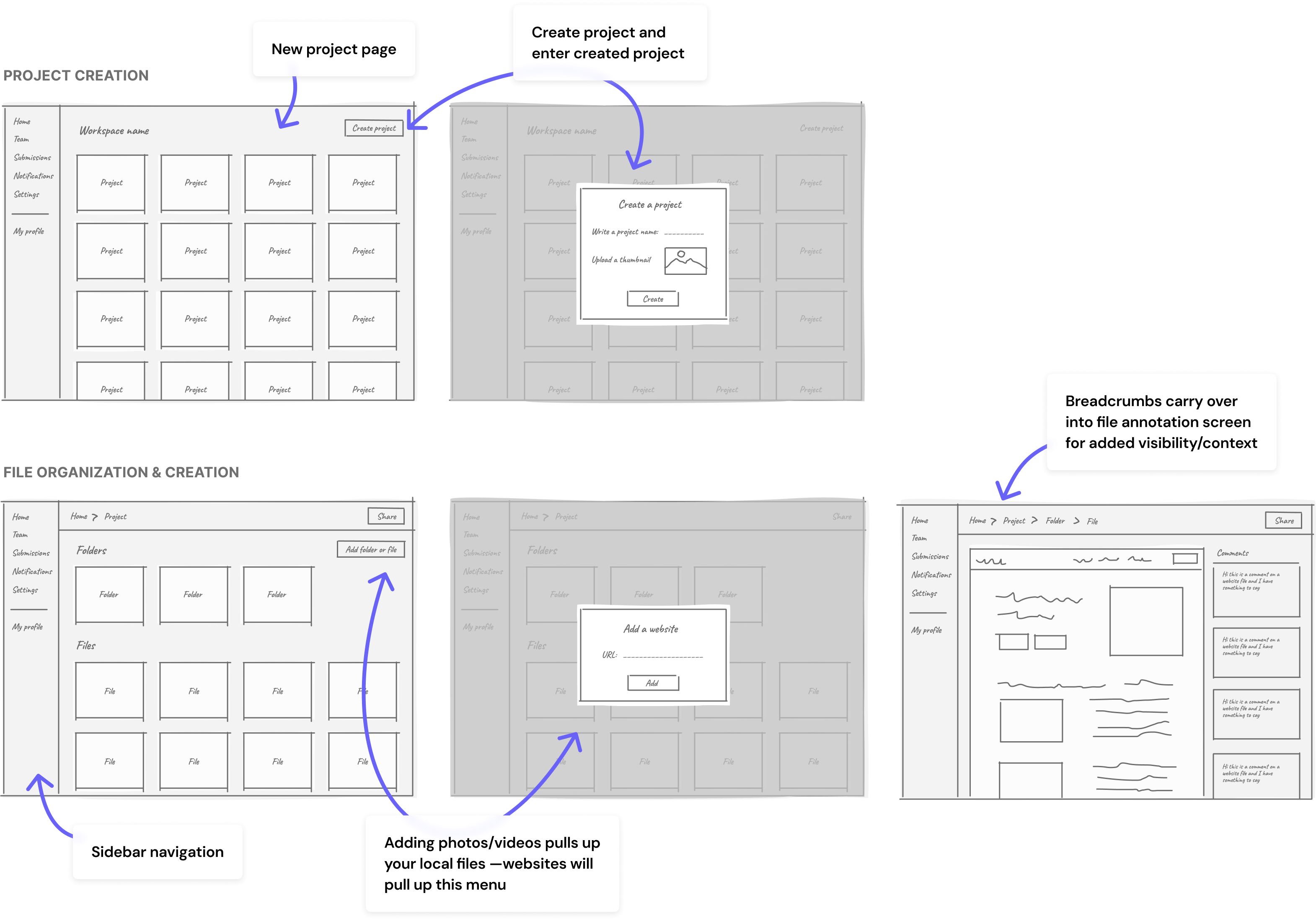
On top of helping me ideate around this new flow, these sketches allowed constructive conversation between me, my PM, and our dev team without committing too much time. Confirming dev feasibility was important to me at this stage since it was my first time working with these engineers. With team feedback I was able to iterate with confidence that new features/functionality were viable.
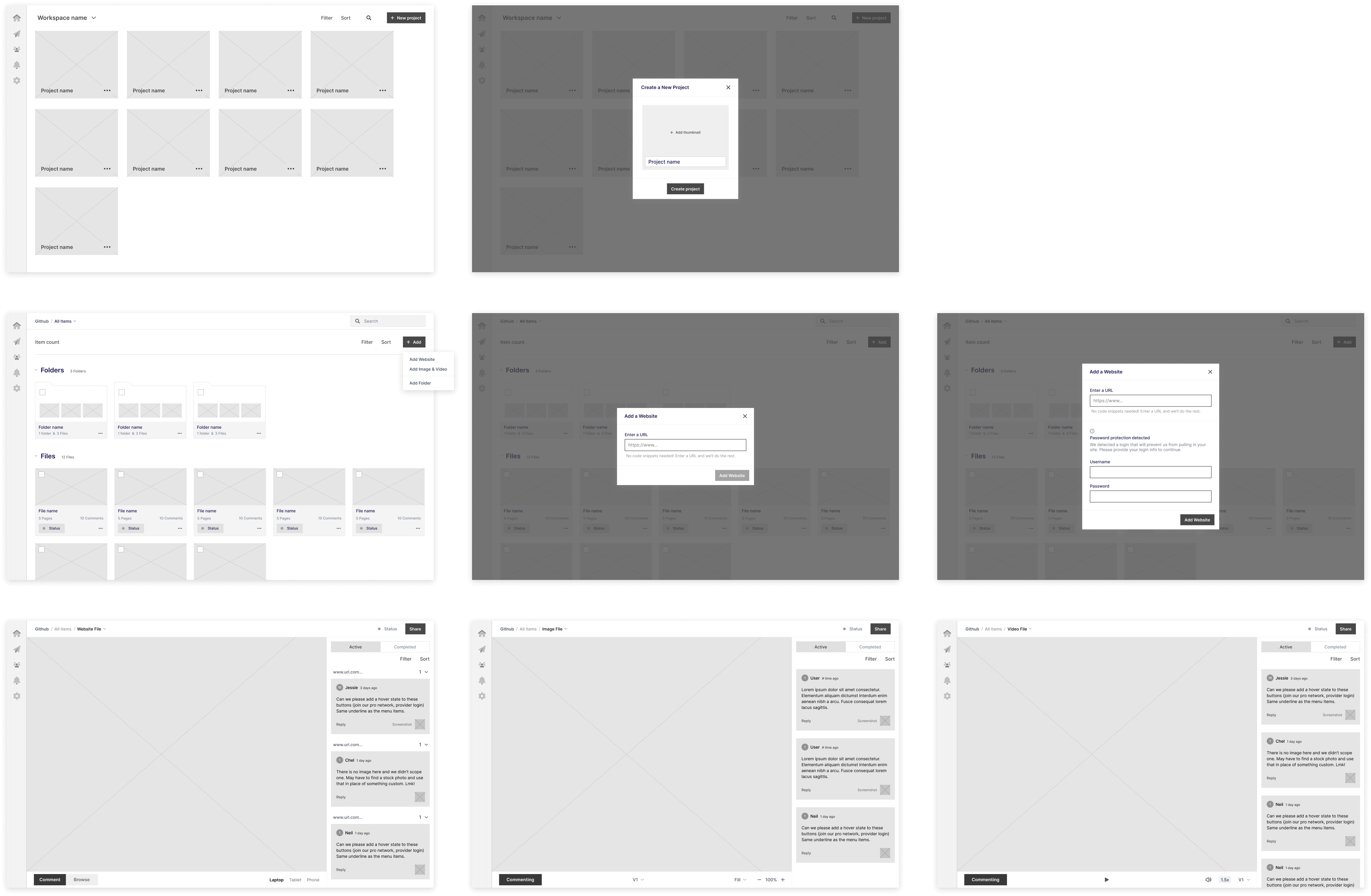
I built wireframes to test with users I had previously interviewed as well as some new users.
Using a Figma prototype, participants were presented with tasks designed to test our solutions for key pain points (4 moderated/4 unmoderated). I organized the main insights and observations into an affinity map, revealing several main takeaways:

All users from initial interviews found the project page helpful and new file naming more intuitive
All participants tried to drag and drop files into folders —highlighting the need for this functionality

7 of 8 participants used the breadcrumb navigation to return to previous folders

5 of 8 participants found the comment/browse button intuitive but 4 felt it was hard to spot initially

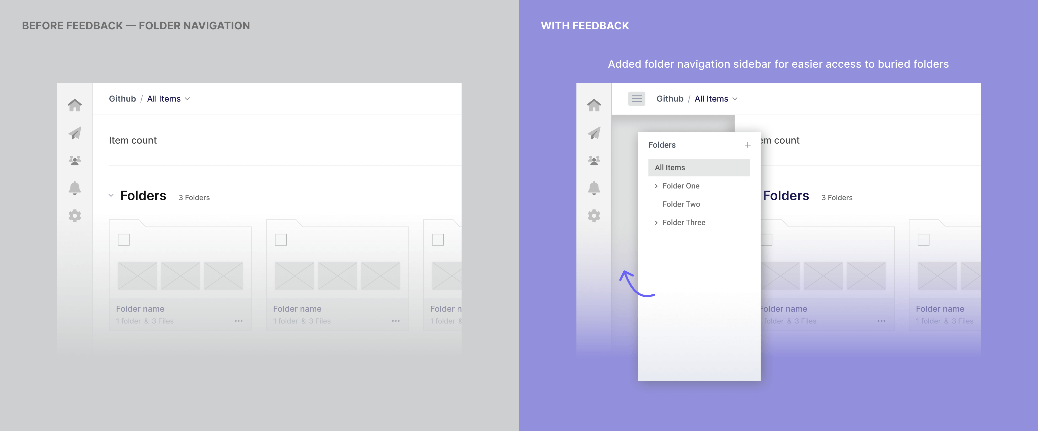
4 of 8 participants expected the sidebar navigation to allow them to browse or save folders for quick access

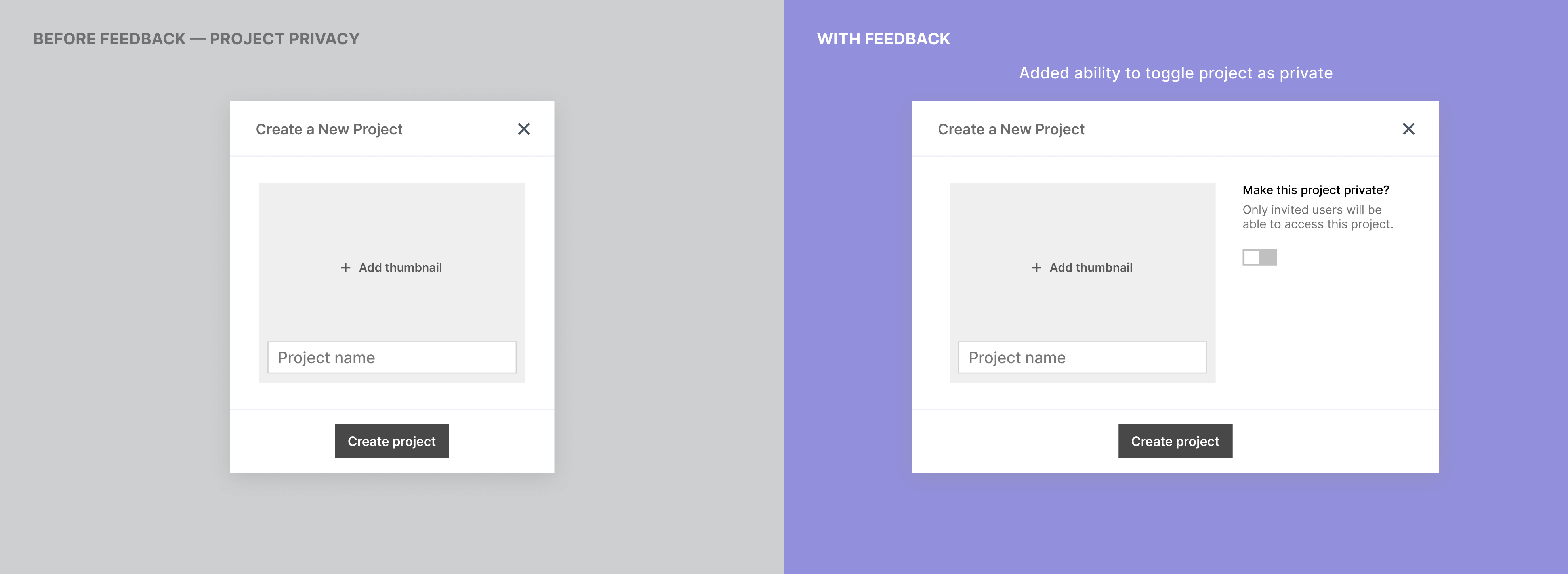
6 of 8 participants said the ability to make projects private was important to their teams
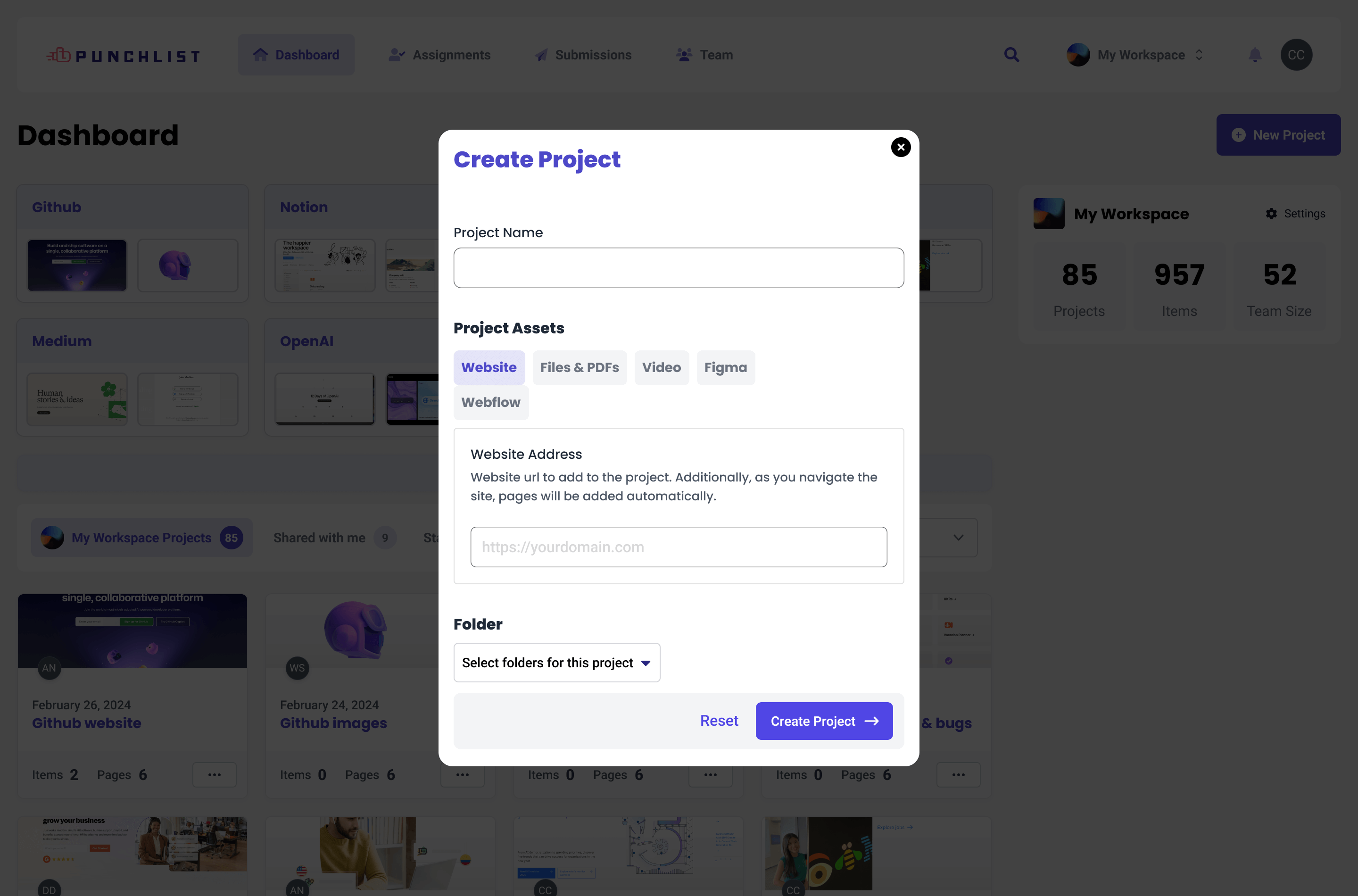
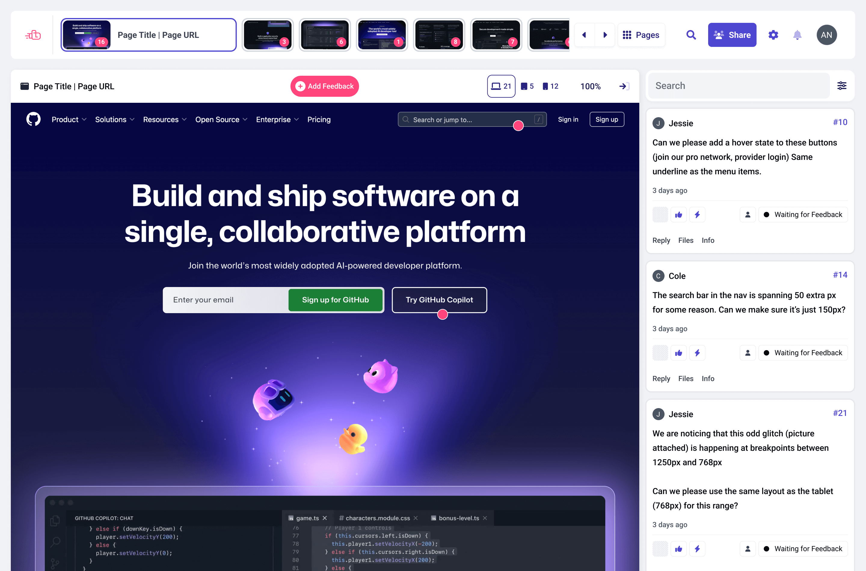
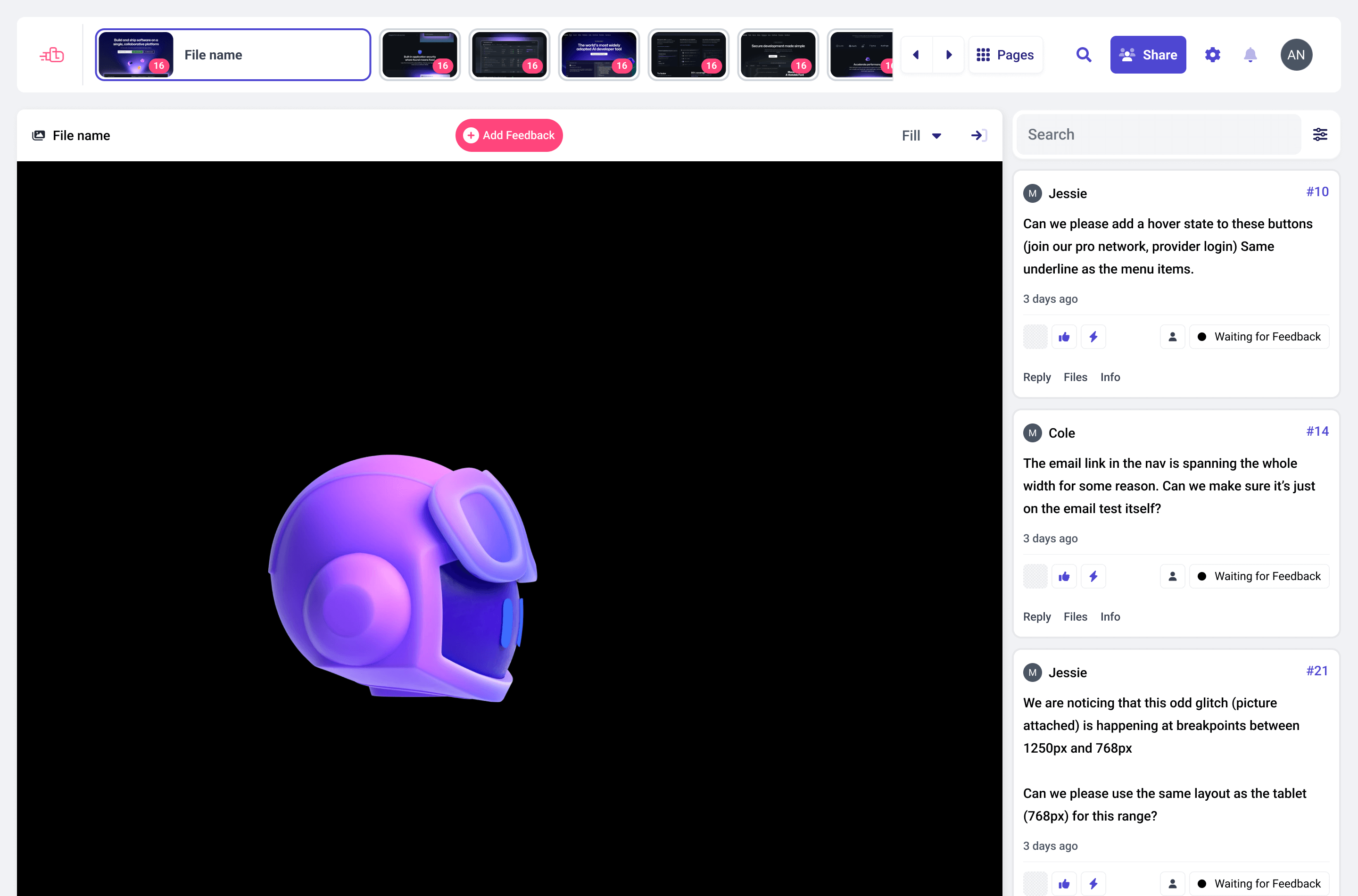
Here are a few interface changes I made in response to user feedback.
With the insights gathered from research and usability testing, the final design of Punchlist's key flows focused on improving navigation, file status visibility, and overall efficiency.
While the goal was to create a more intuitive and modern interface, we also prioritized maintaining alignment with the app's existing design language. This ensured that the update would feel like a natural evolution, rather than a jarring departure from the rest of the product.
I isolated four key improvements that directly addressed our users' pain points.
Note: Github and other companies were used for placeholder content in prototypes.

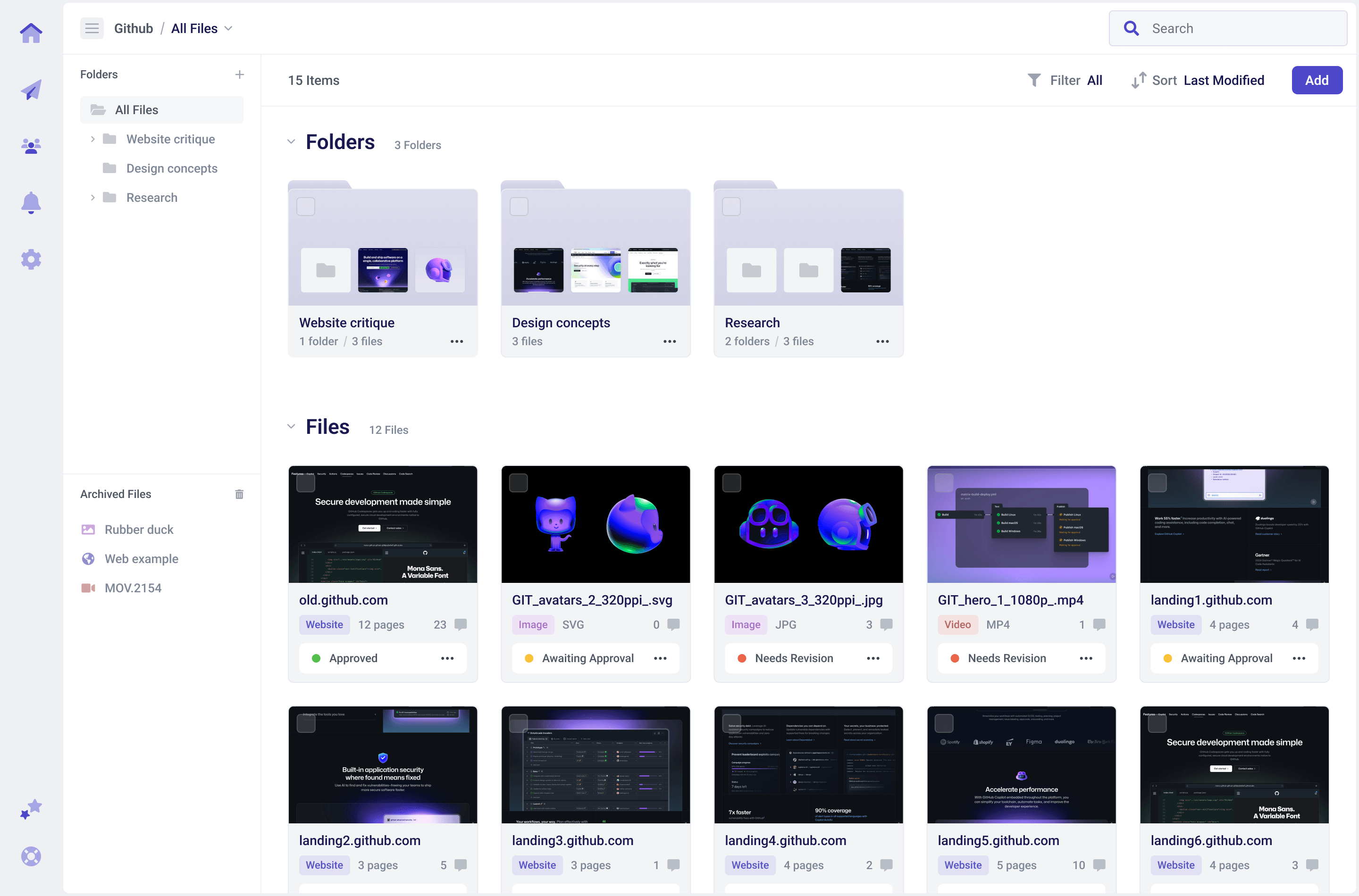
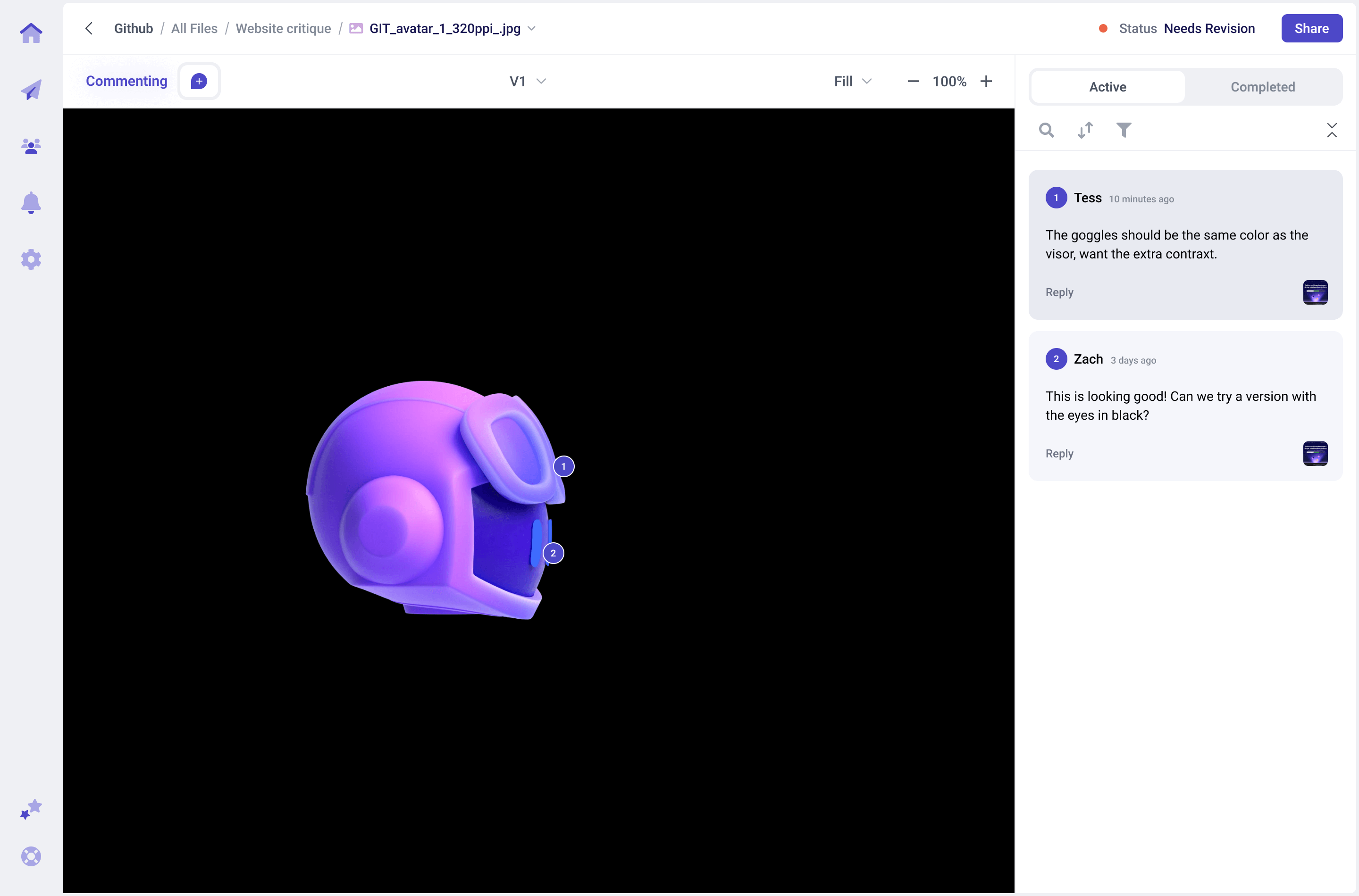
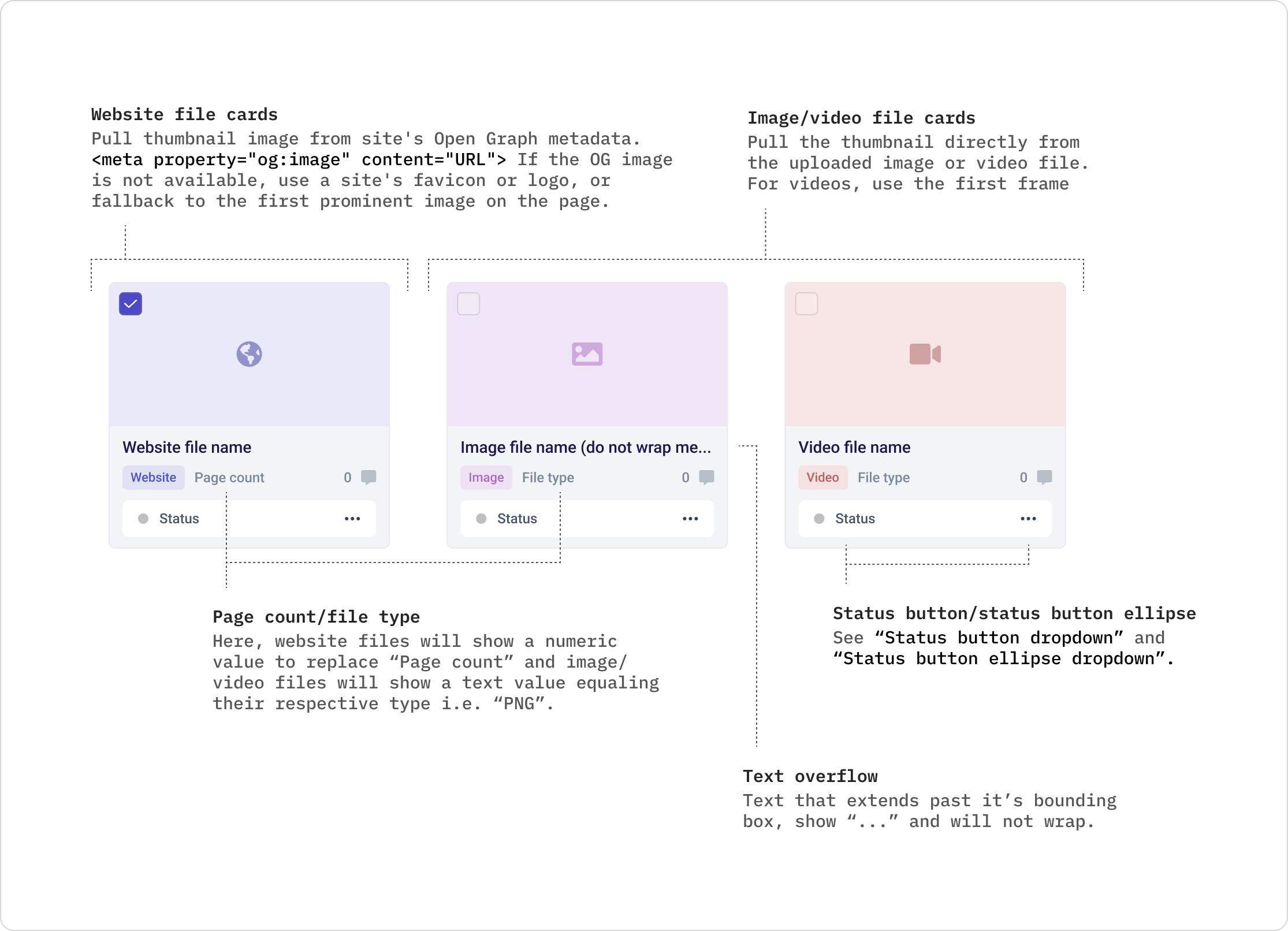
Distinct file cards with visible statuses
Users can now easily distinguish between website, image, and video file types from their folder.
File status is also visible and editable directly from the file card, allowing status updates without opening the file.

Clear separation of projects and files
A more linear structure was added where a file free-for-all was failing.
The newly added project page provides a clear separation for teams managing multiple clients or those who prefer organizing their work into distinct project spaces.
Clear separation of projects and files
A more lineal structure was added where a file free-for-all was failing.
This added page allows for clear distinction for teams who have multiple clients or like separating efforts into individual project spaces.

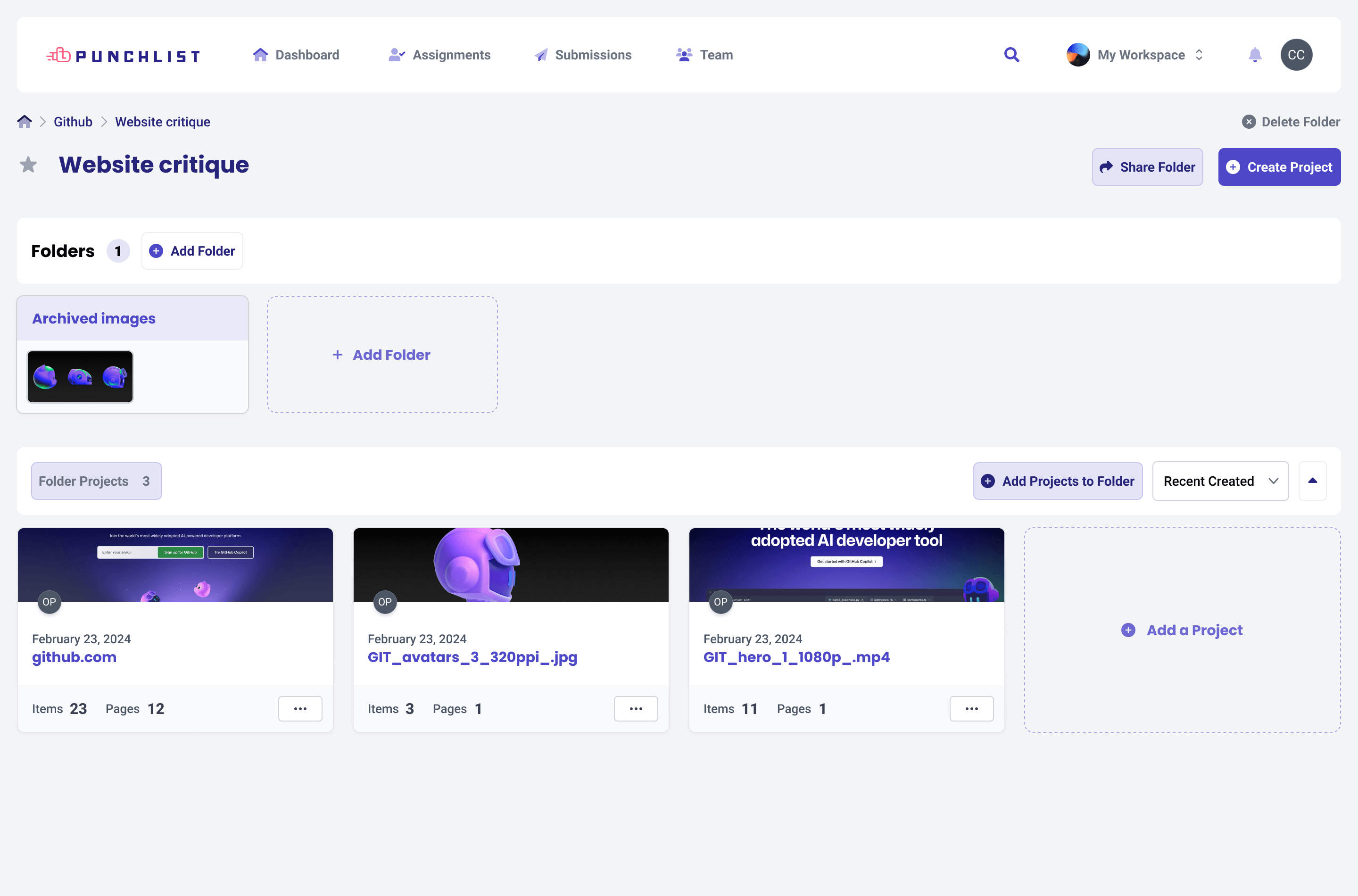
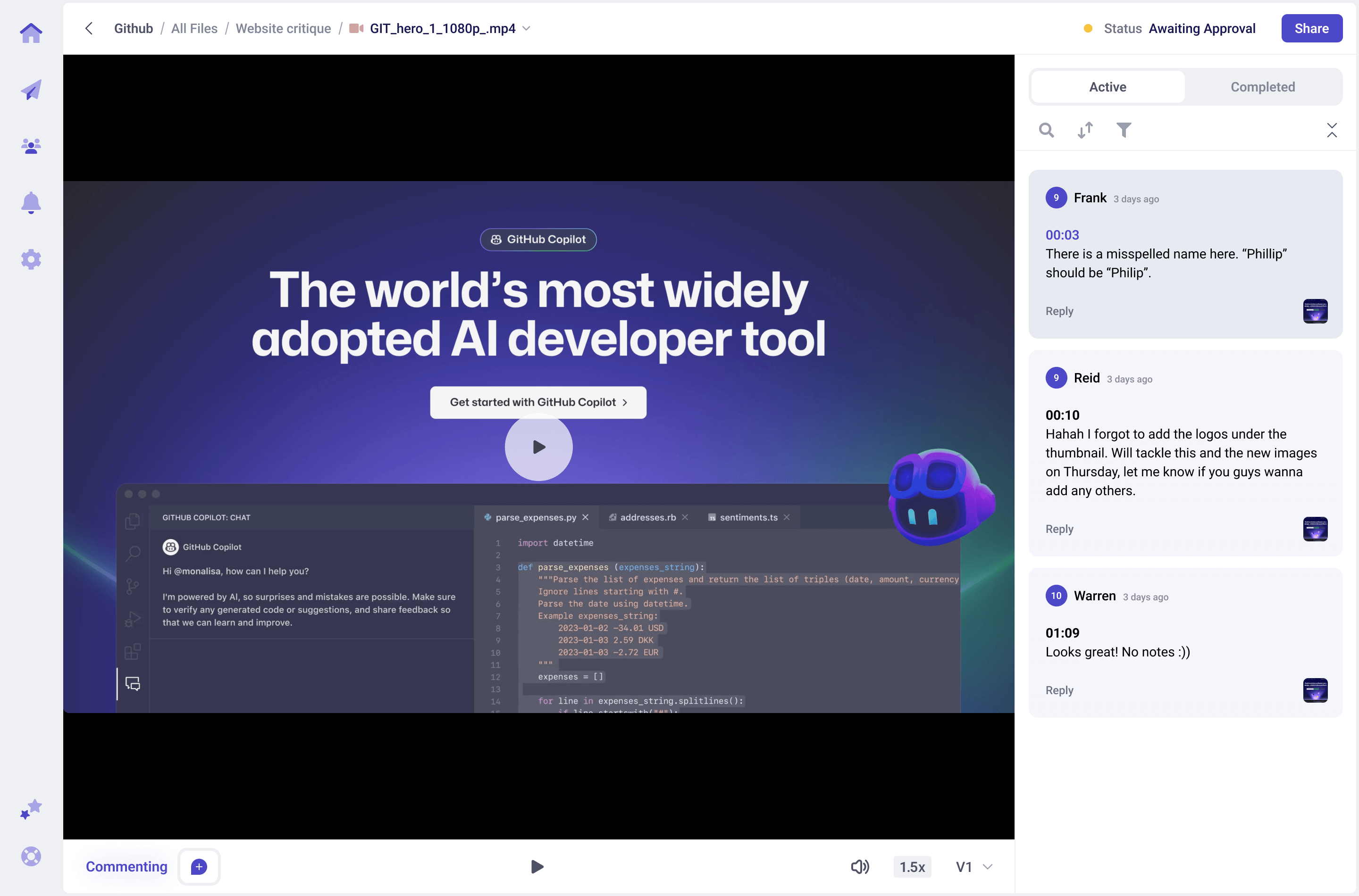
Clear & consistent navigation
Breadcrumbs now appear on file pages, providing quick access to parent folders and improving navigation clarity. Additionally, a toggle-able folder explorer sidebar makes it easier to access deeply nested content.

Decluttered file pages and added clear browse & comment modes
Previously, clicking internal links while browsing a website automatically added URLs to your file, making misclicks frustrating. A new comment/browse toggle gives users control, adding URLs only when leaving the first comment on a new page.
URLs are also now housed in the right sidebar, keeping them contextually aligned with their comments.
I was excited by how many user concerns we successfully addressed in a relatively short time span. These final screens mark the beginning of Punchlist's new identity and a stronger, more user-friendly experience.
To ensure a smooth rollout, I collaborated closely with the engineering team, focusing on feasibility and technical constraints early in the process, as well as dev guidelines for final designs.
Additionally, I synced with the team working on pricing and onboarding to align our efforts, ensuring a seamless experience from the marketing site to in-app workflows.
With validated design solutions and cross-team alignment in place, next steps involve phased implementation, continued iteration based on feedback, and onboarding content to help existing users transition smoothly. This work positioned Punchlist for a more enjoyable, scalable future, and I'm excited to see these improvements come to life.
Within 2 months post-launch, this effort combined with an onboarding flow redesign contributed to huge revenue increases.
This project set the stage for ongoing design system efforts and let to a doc that acted as a single source of truth for designers and engineers.
Our users were excited to be involved in making Punchlist better and the changes directly improved their workflows and team collaboration.
Although not my initial intention, this project became our standard for pitching features and breaking design/dev silos.