Employer
Marketwake
Platform
Desktop
Areas
Strategy, research, IA, UX
Duration
4 months
UX/UI designer
As UX/UI lead, I did research, testing, and high-fidelity wireframing/design while delivering key strategy and design outputs.
UX/UI designer (me), UX intern, associate creative director, copywriter, visual designer, project manager, and engineer.
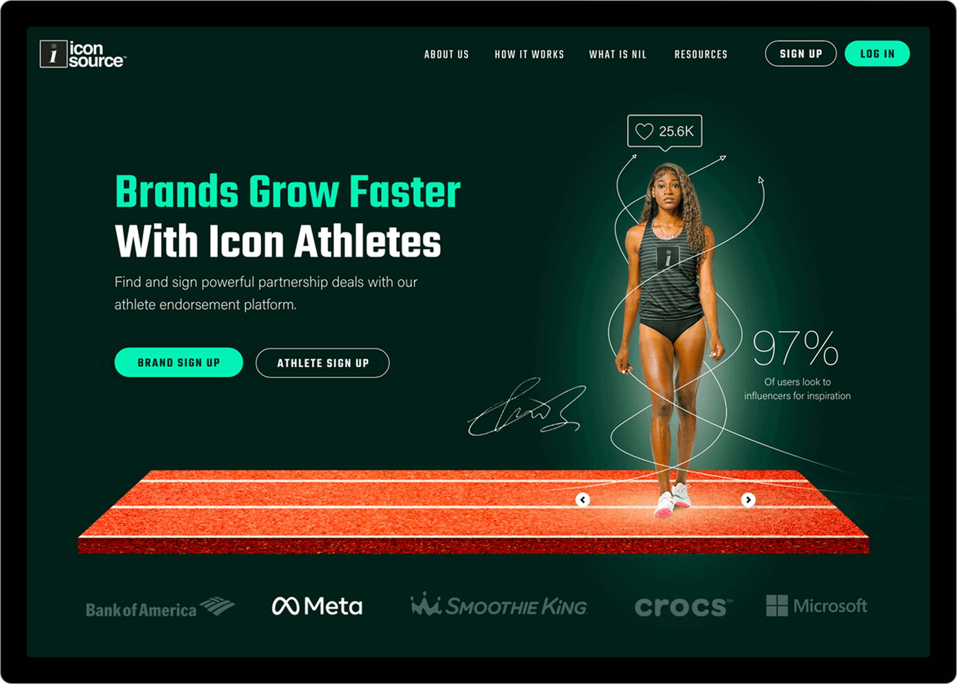
Icon Source is the leading platform for brand-athlete partnerships and a frontrunner in collegiate NIL (Name, Image, Likeness) deals. Beyond facilitating endorsements, it serves as a key player in NIL news and content creation.
Notably, Icon Source brokered the first NCAA athlete endorsement in history between the Cavinder twins and Boost Mobile.
Additionally, as NIL laws rapidly expanded across the U.S., Icon Source needed to position itself as the go-to resource for NIL news and education. Their goal was to create a more self-sufficient platform that preemptively answered user questions through a well-structured website.
Research
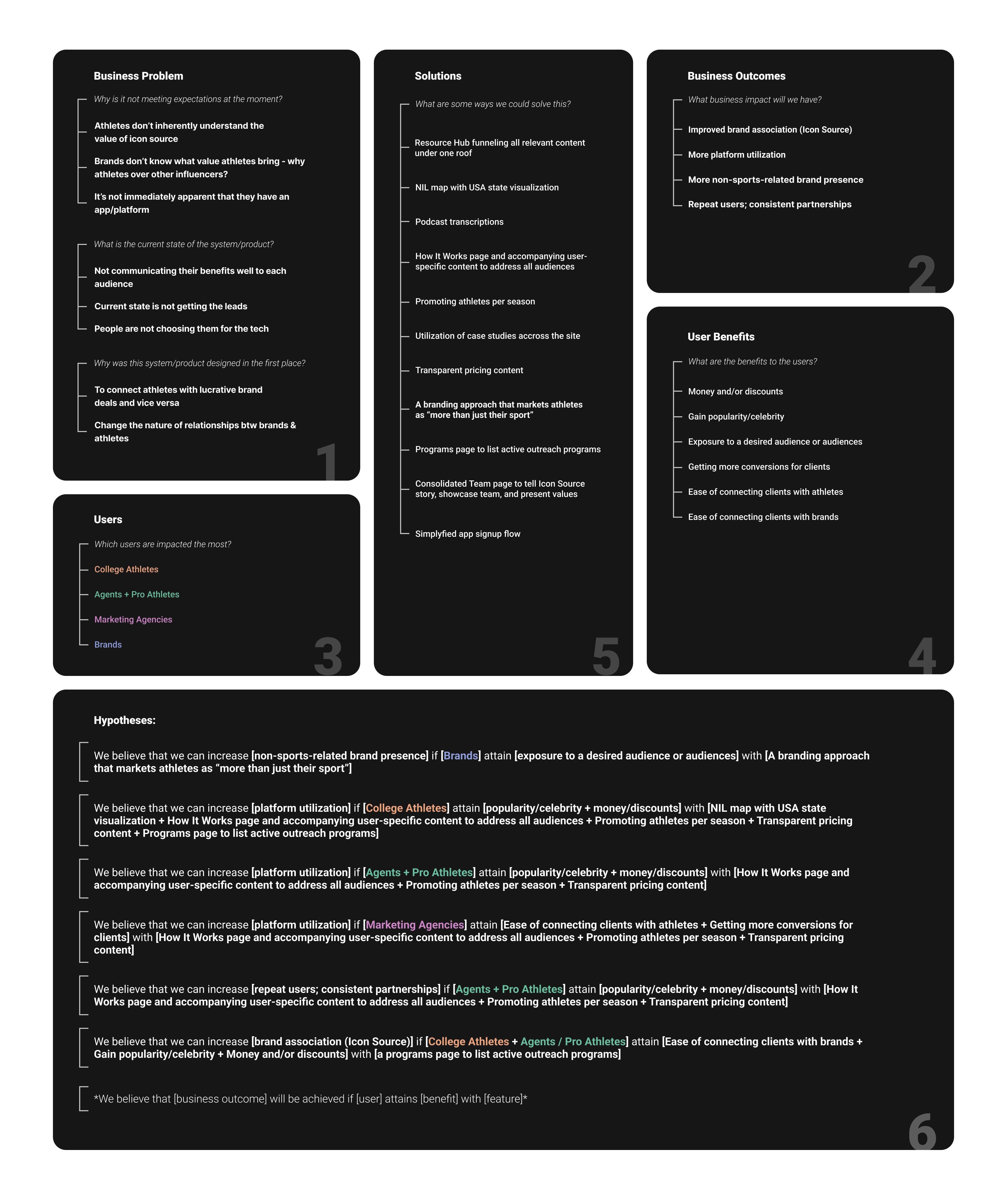
Collect and analyze quantitative and qualitative data on Icon Source users, then translate insights into clear, achievable goals within the project's timeline and scope.
Stakeholder interviews
User interviews
Heatmap analysis
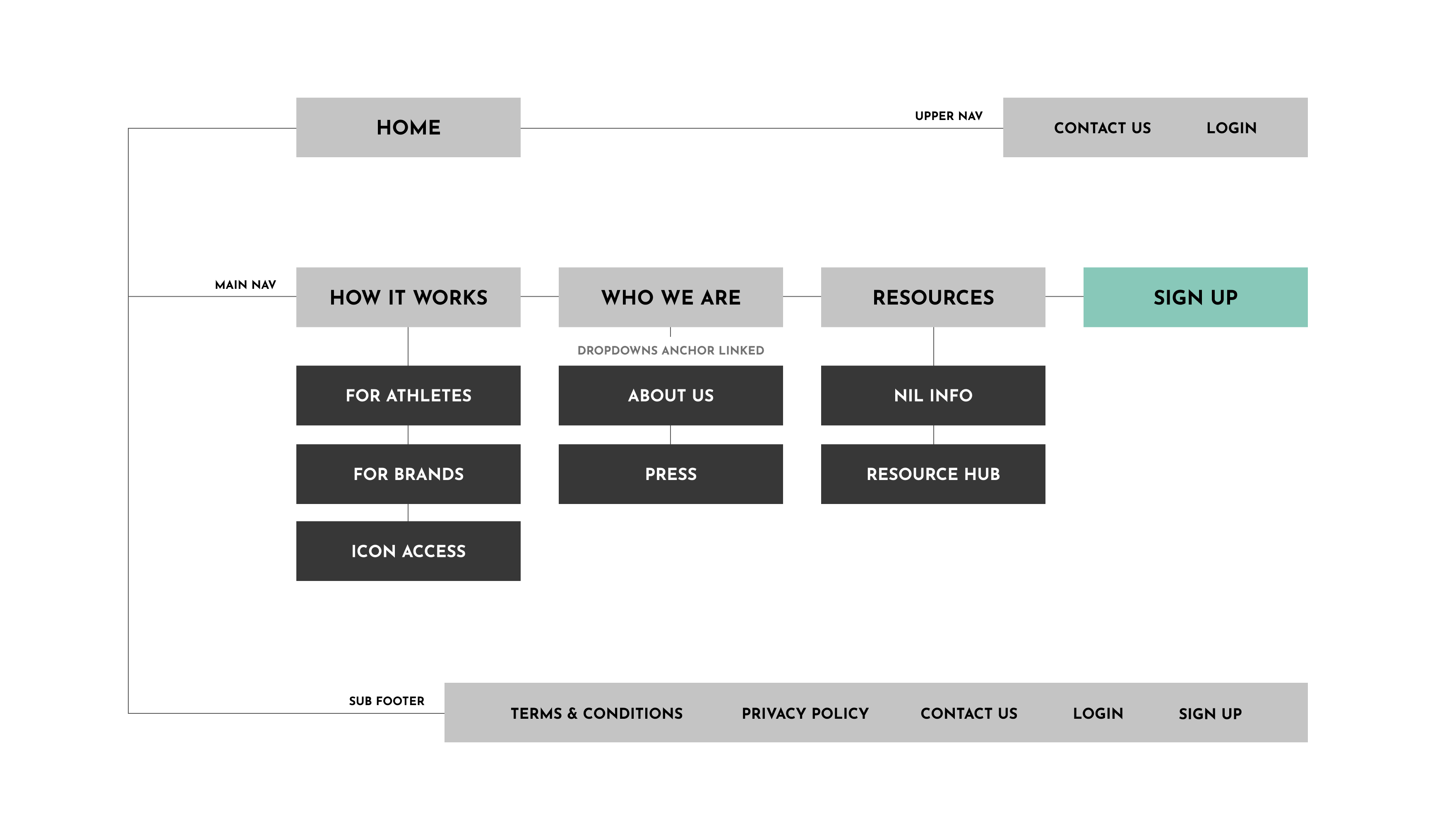
Restructuring
Map the existing site architecture and propose a revised structure aligned with user needs. Once approved, organize on-page content for a more intuitive experience.
Lean UX canvas
Sitemap brainstorm
Sitemap creation
Content index brainstorm
Content index creation
Wireframing
Develop high-fidelity wireframes based on the content structure, ensuring alignment with user goals and securing client approval before visual design begins.
Hi-fi wireframes
Visual design
Refine wireframes into polished mockups, iterate based on feedback, and finalize designs for seamless handoff to development.
Mockups
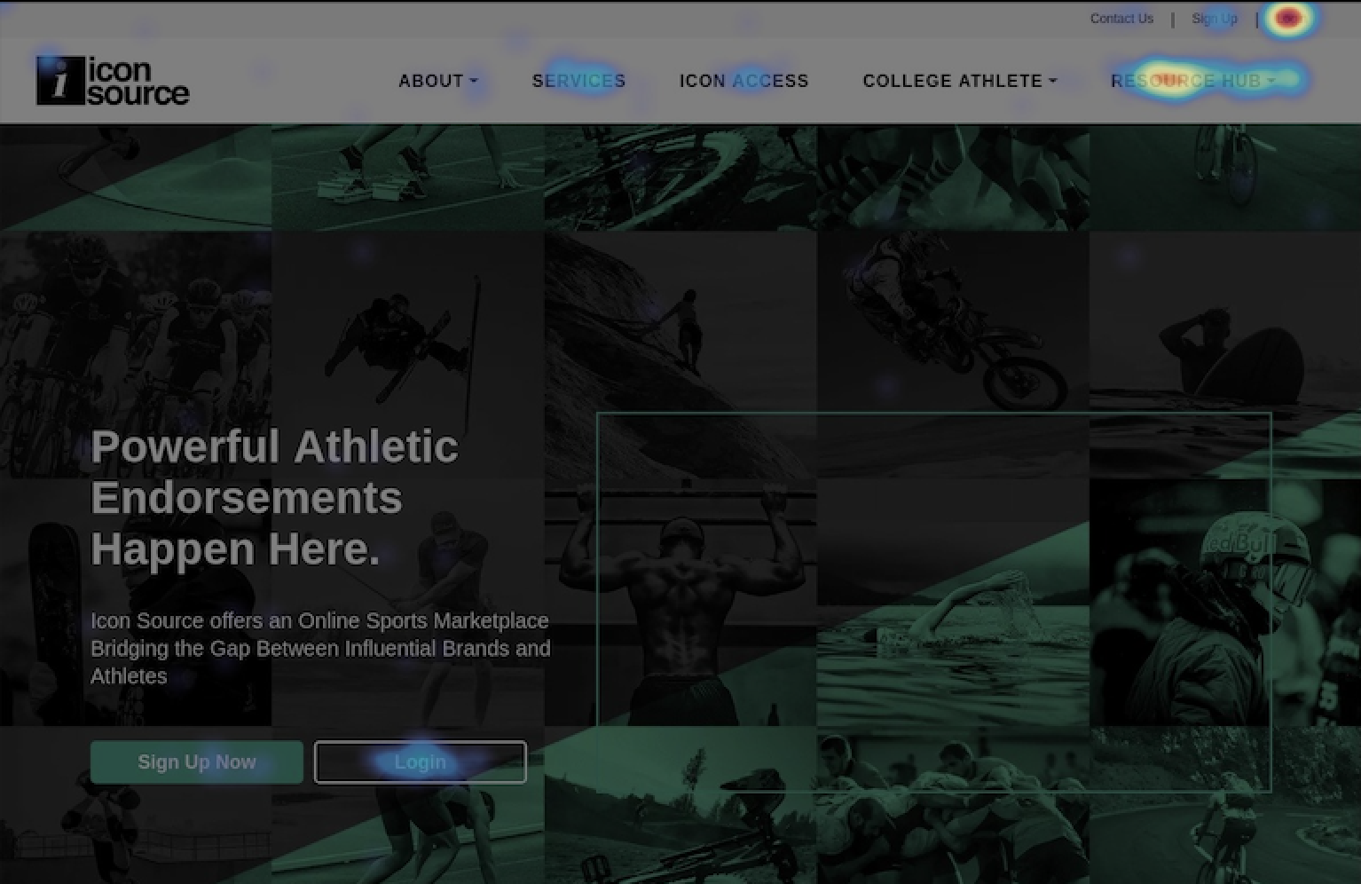
I started with a heat map analysis using Hotjar to identify and understand user behavior patterns on the old site.
Hotjar analysis of homepage hero
Although user interviews weren't initially in scope, I advocated for them to supplement stakeholder insights. After working with the client, we secured interviews with two brands and one recruiter, providing valuable firsthand perspectives to guide our approach.
Stakeholder interview findings (CEO & COO)
Sentiments:
• Our competitors are tech-focused, we are people-focused
• Athletes don't inherently understand the value of icon source
Needs/Concerns:
• Looking to improve UX and user journey
• Site structure is all over the place, we need to start over
• Users need to trust us and know that we have their backs
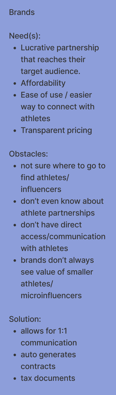
User interview findings (2 brands + 1 recruiter)
Sentiments:
• Likes that Icon Source is safe for athletes
• Love that it handles tax documents, contract laws, and implications that students may not understand
Needs/Concerns:
• Wants up-to-date NIL information
• It's not immediately apparent that they have an app/platform
• Have trouble finding resources on the site, navigation keeps changing
I used a Lean UX canvas to facilitated brainstorm sessions and build a shared understanding of our users and their goals/needs.
Sitemap combined with content index per page
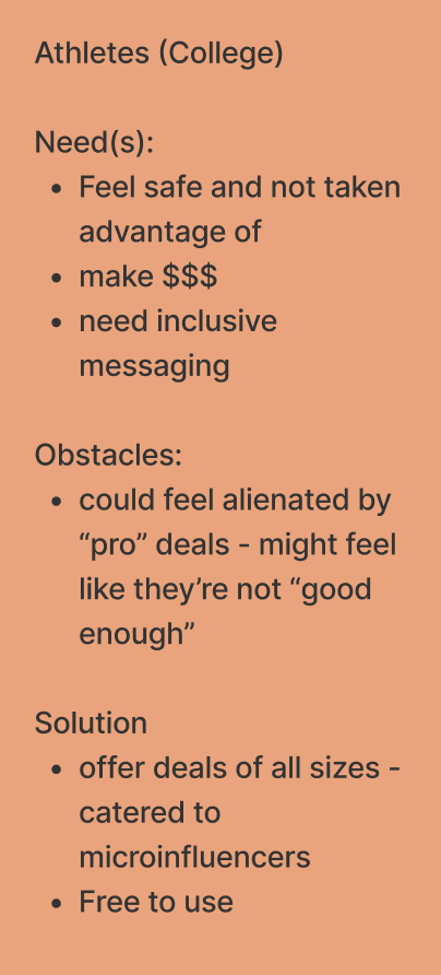
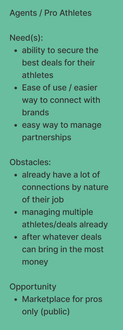
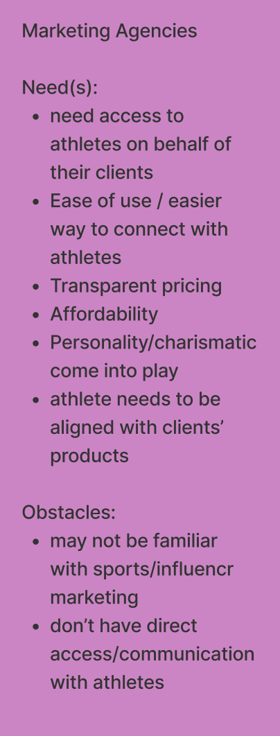
Expanded user-types
Instead of analyzing and revising the sitemap alone, I facilitated team brainstorms to align on structure and content organization. This approach ensured a shared understanding of user needs and business goals while fostering collaboration. These sessions led to a more effective sitemap and content index, resulting in a stronger foundation for the redesign.
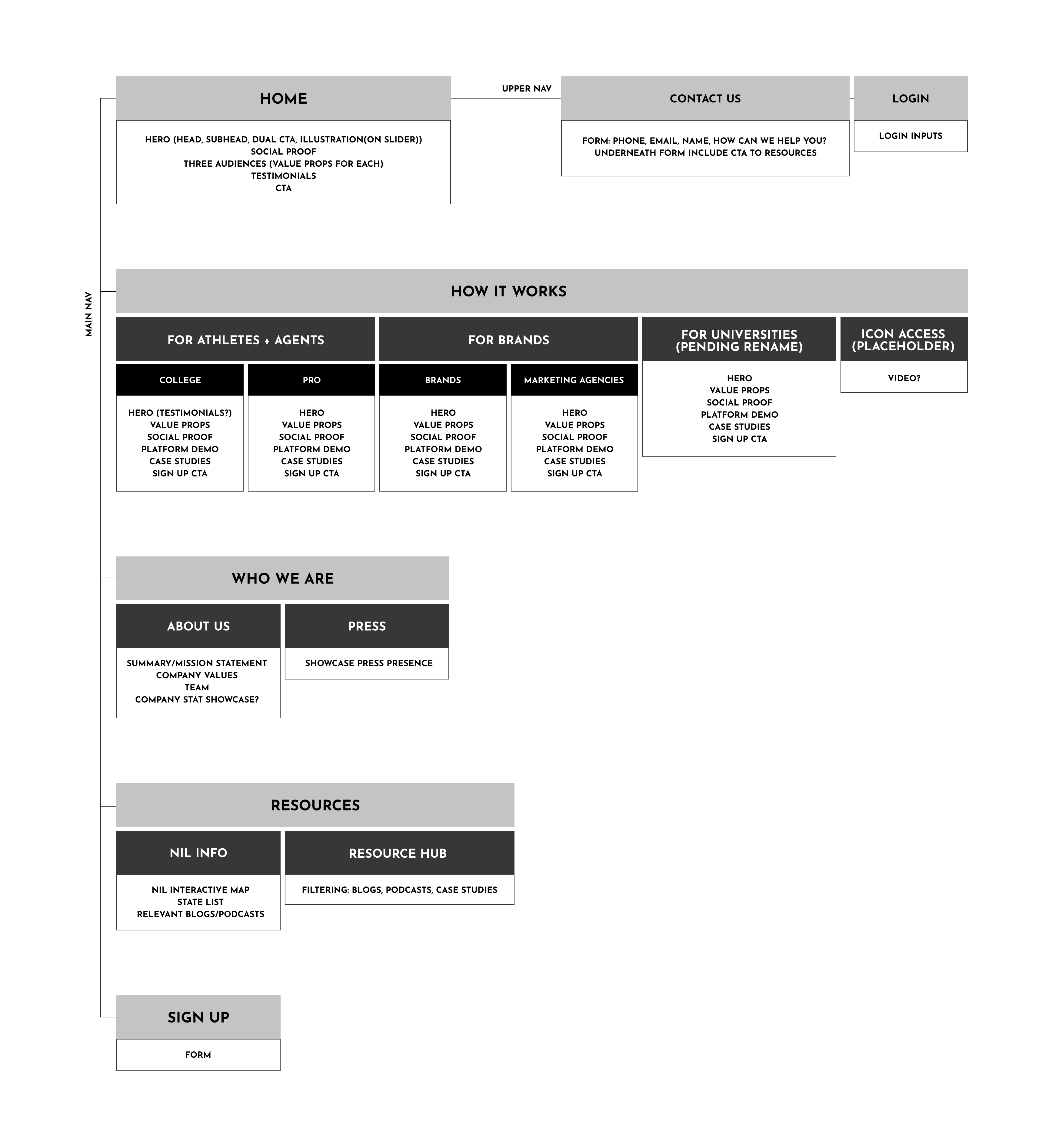
Once we had enough data to make confident decisions on layout and flow, I started building out high-fidelity wireframes. The client reviewed them in two rounds of revisions to fine-tune the designs. The early research really paid off here, as the client felt the wireframes accurately reflected their users' needs.
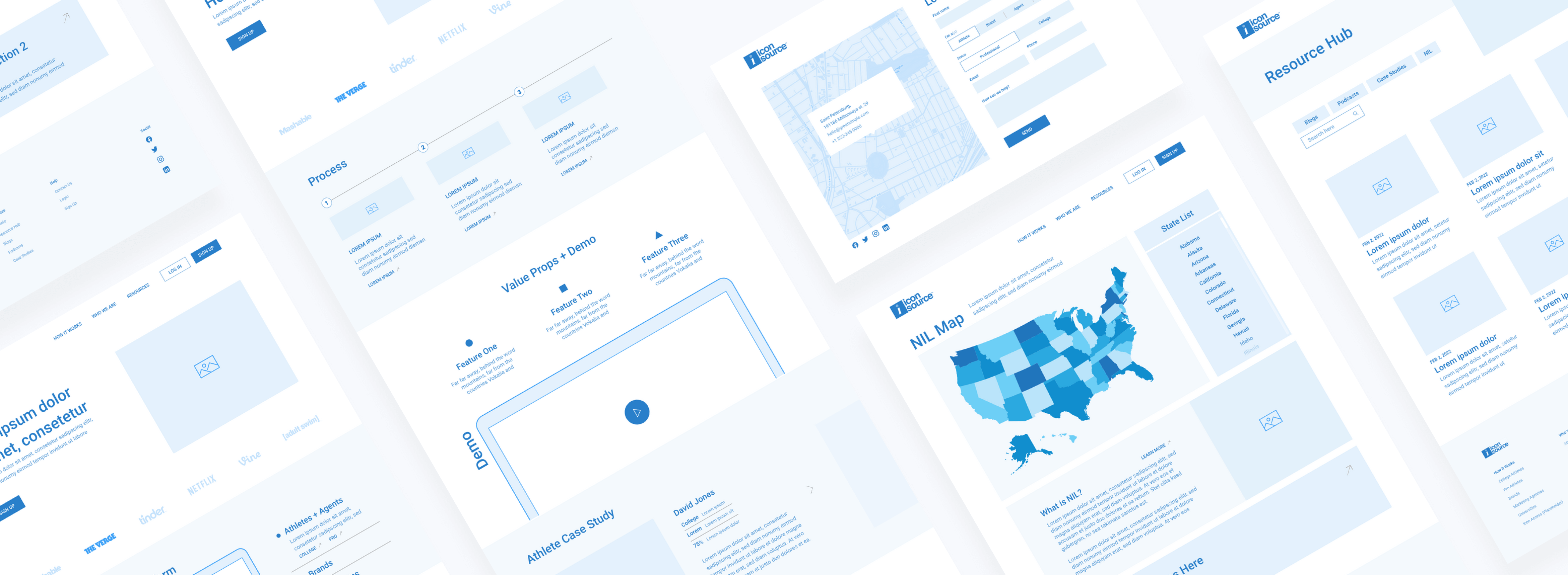
In the final design iterations, I refined the layout and visuals, supporting on interaction-heavy sections and UX copy —collaborating with the copywriter to ensure the copy was clear, concise, and helpful, guiding users smoothly through the platform. This collaboration ensured both the design and messaging worked cohesively to enhance the overall user experience.
Key improvement 1
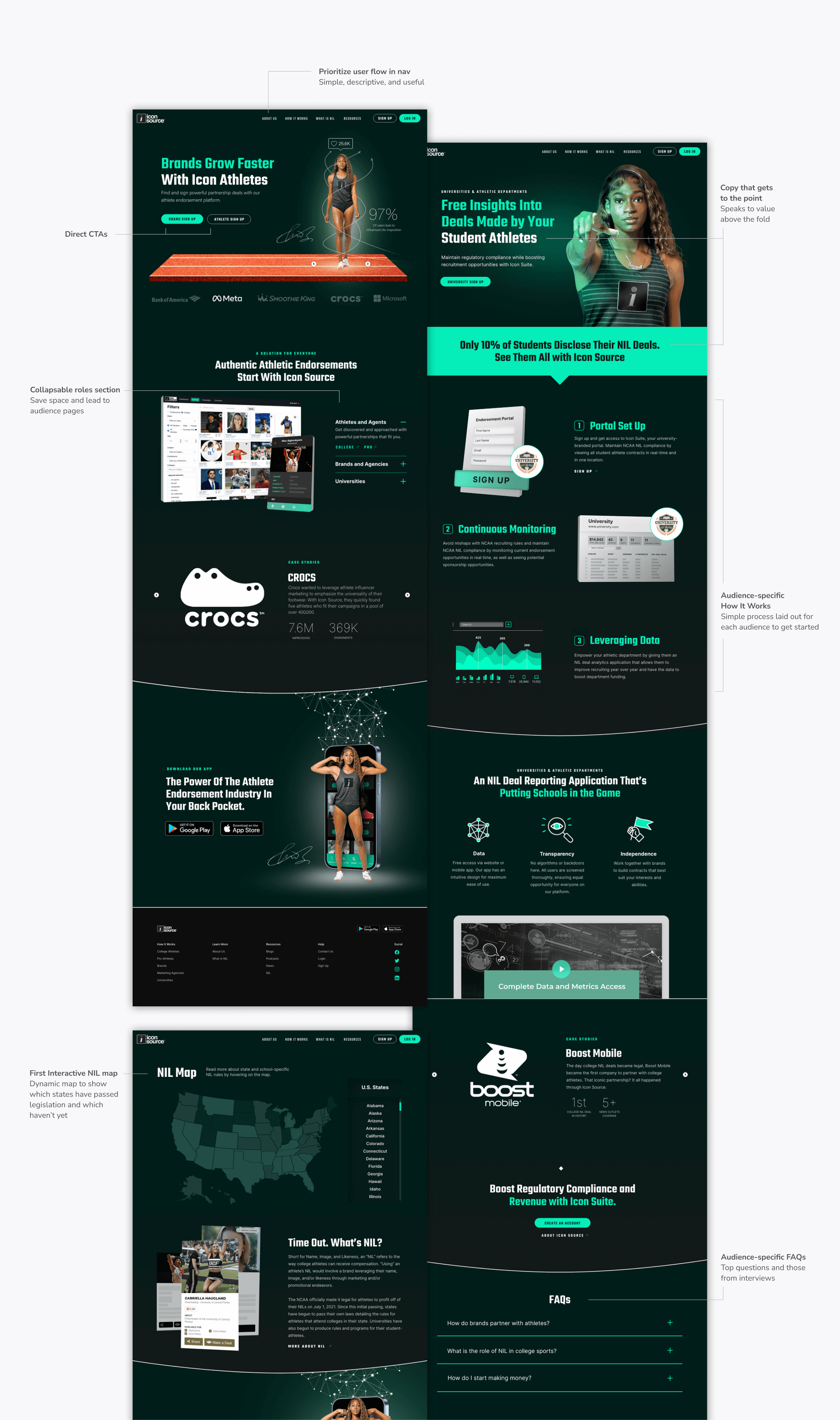
Simple navigation
The new Icon Source website offers a more streamlined experience for college athletes, pro athletes, universities, brands, and marketing agencies. By simplifying the process, it enables users to make more informed decisions and navigate the platform efficiently.
Key improvement 2
How it works pages
We created tailored "How It Works" pages for each audience, offering clear, step-by-step guidance to address their unique needs and simplify navigation.
Key improvement 2
How it works pages
We created tailored "How It Works" pages for each audience, offering clear, step-by-step guidance to address their unique needs and simplify navigation.
Key improvement 3
Interactive map
We developed the first interactive NIL map to track shifting NIL regulations, designed for continuous updates as new laws are passed, keeping users informed and ahead of the curve.
Room for improvement… We could have conducted usability testing both before and after creating mockups to refine our designs and better challenge our assumptions. Additionally, QA for UI consistency and accessibility should have been done after mockups were completed to ensure we met all standards.
Heatmapping, while helpful in some contexts, wasn't a perfect substitute for user testing or interviews. Without a large volume of traffic or extended time range, the insights it provided were often anecdotal and could even reflect our own team's interactions due to a lack of IP address filtering.
Positives... Despite these missed opportunities, this project allowed me to introduce and implement new steps in our process. These changes led to stronger team alignment, improved morale, and a deeper understanding of user needs.